Few bands have tied together their music and album covers in as much intricate detail as Rush. From their third album, Caress Of Steel, to 2012’s swansong Clockwork Angels, the Canadian trio’s sleeves were loaded with symbolism, lyrical references, in-jokes and Easter Eggs – a result of the enduring collaboration between the band and their longtime artist/designer Hugh Syme.
This fruitful creative relationship is the subject of lavish coffee table book, The Art Of Rush: Serving A Life Sentence, authored by Stephen Humphries and about to be reprinted in an updated edition. In it, Syme and the band – including the late Neil Peart – take a deep dive into each iconic sleeve, shining a spotlight on how they were created and revealing the secrets behind the famous imagery.
Here are 31 things we didn’t know before we read it.

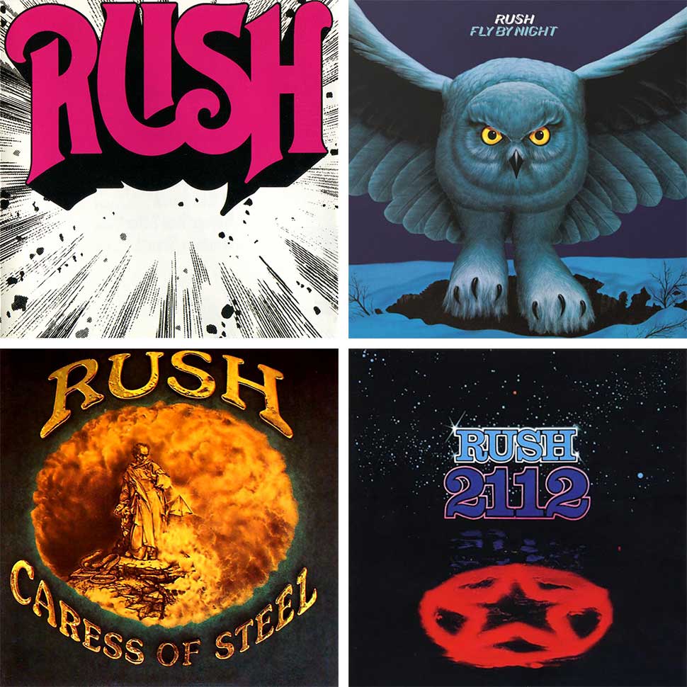
1. The pink Rush logo exploding from the cover of the band’s 1974 debut album was designed by Paul Weldon of Canadian band Edward Bear. The logo supposed to be vivid red, but was changed by the label without the band’s knowledge, to their annoyance.
2. The cover of 1975’s Fly By Night was inspired a picture of a snow owl new-boy drummer Neil Peart had once seen. The sleeve painting was by Playboy magazine artist Eraldo Carugati.
3. More unwanted record label tinkering: the band logo and title of 1975’s Caress Of Steel (Syme’s first collaboration with the band) were originally supposed to be metallic silver, but changed once again without Syme or the band’s consent.
4. No camera trickery was involved in getting the shimmering star on the front of 1976’s breakthrough 2112: it’s a photograph of a star, covered in red gel and immersed in water in a specially built Perspex aquarium measuring 30-inches by 20 inches by 5 inches.
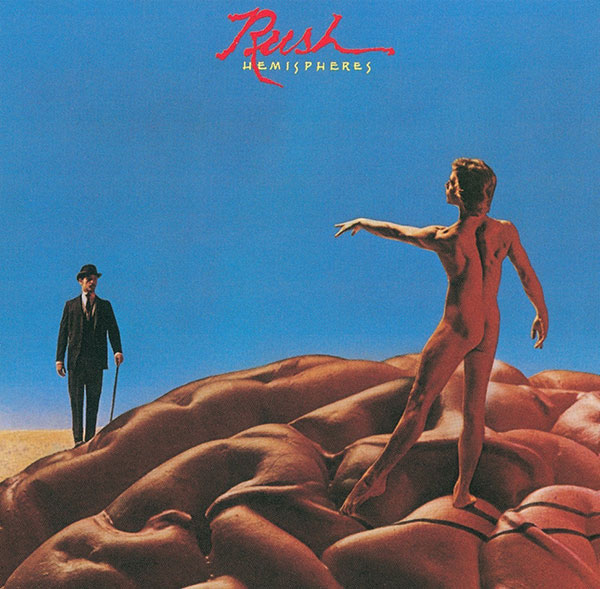
5. The original Starman and the bower-hatted businessman – aka Dionysus – from 1978’s Hemispheres are the same person: Hugh Syme’s friend and assistant Bob King.
6. King appears on two more Rush sleeves: he’s the boiler-suited workman on the left of the Moving Pictures sleeves, carrying the portrait of Joan Of Arc. He also reprised that character on the back cover of 1981’s live Exit… Stage Left.
7. The ruined building in the foreground of 1977’s A Farewell To Kings’ sleeve was a recently-demolished warehouse in Buffalo, New York. That image was superimposed against a shot of the Toronto skyline – the skeletal structure in the background is the then-under construction CN Tower, soon to be the world’s tallest building.
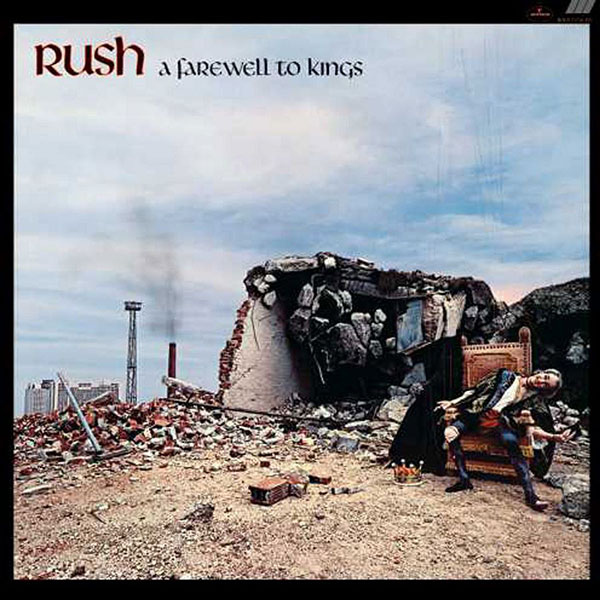
8. The puppet-king slumped on the throne on A Farewell To Kings is Josh Onderisin, who played alongside Hugh Syme in Canadian rockers The Ian Thomas Band. After Ondersin was too ill to recreate the role for the cover of 1981’s Exit… Stage Left, his place was taken by one Ian Melhuish, who Syme and Rush manager Pegi Cecconi found randomly on a Toronto street. Melhuish was paid with a $200 stereo.
9. The brain from 1978’s Hemispheres was a model borrowed from the University Of Toronto’s medical facility. Syme wanted to use a real brain, even approaching the family of someone who had donated their organ to the university, but baulked when he saw it sloshing around in a jar in an autopsy room.
10. For the cover of 1980’s Permanent Waves, Syme originally planned to hook the three members of Rush up to electroencephalogram (EEG) machine as they played and use an image of their brainwaves on the cover.
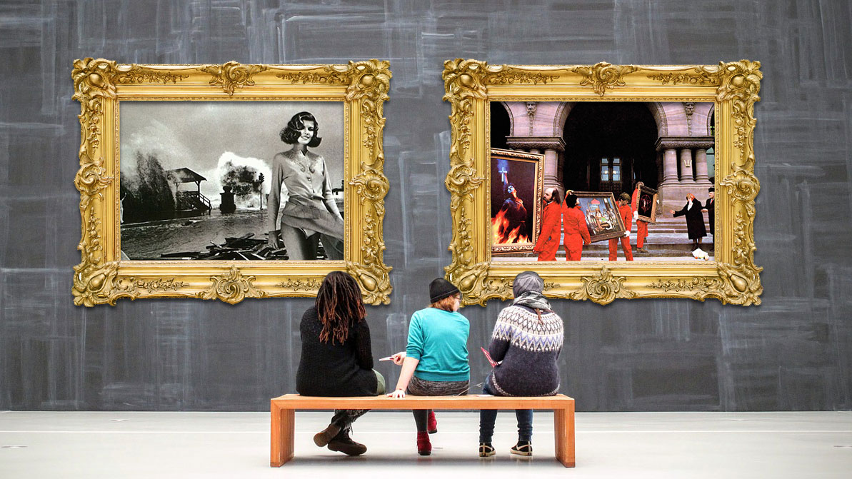
11. The final Permanent Waves cover features model Paula Turnbull in a billowing dress, cut into a photograph of Hurricane Carla wreaking havoc on Galveston, Texas in 1961 (Turnbull was flown in from Paris to recreate her role on Exit… Stage Left).
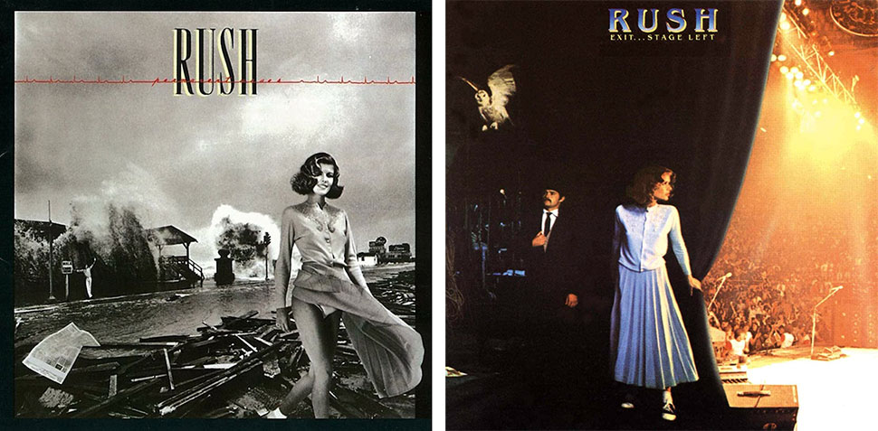
12. Easter eggs abound on the Permanent Waves sleeves: both Pearl beer and Coca Cola refused to let Syme use their logos in the background, so he adjusted them to read ‘Peart’ and ‘Lifeson’ instead, adding ‘Lee’ in lights for completeness’ sake. And the man waving in the background? Syme himself.
13. The Moving Pictures cover photo was famously taken outside the Ontario Legislative Building in Toronto. The roll-call of boiler-suited workmen is, from left, our old friend Bob King, his walrus moustache’d friend Mike Dixon (who also appeared on Exit… Stage Left), Mario Prudenti (a waiter acquaintance of Dixon’s, carrying the portrait of US President Calvin Coolidge), an unknown ‘actor’, plus Crowbar frontman Kelly Jay, hoisting the Starman painting.
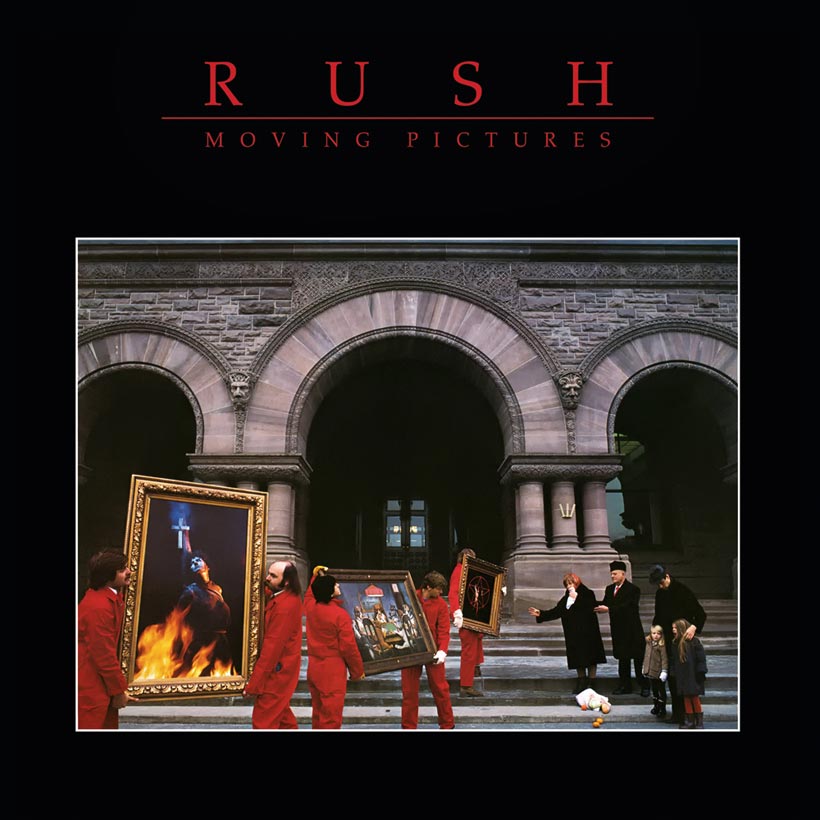
14. More Moving Pictures people: the father comforting his children on the right of the photograph is Vladymir Rogov of short-lived Canadian band Arkitex, while the elderly couple whose groceries have spilled onto the pavement were the Russian parents of a hairdresser who worked at a local Vidal Sassoon salon. And the Joan Of Arc figure in the first painting? That’s photographer Deborah Samuels, who actually took the Moving Pictures image.
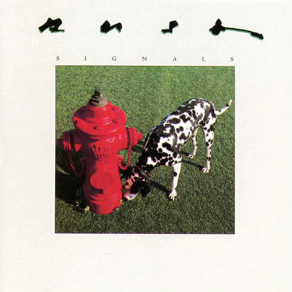
15. The cover of Signals is less naturalistic than it looked. The scene was built in photographer Deborah Samuels’ studio, with AstroTurf ‘grass’ and a hydrant borrowed from the Toronto Department Of Public Works. The dog itself belonged to a friend of a friend of the band, and was bribed to sniff the hydrant by some strategically placed doggie treats underneath it.
18. The vivid painting that adorns the front cover of 1984’s Grace Under Pressure is a literal interpretation the album’s title: tranquil white ‘grace’ beneath of the ominous ‘pressure’ of storm clouds. Small, painted ‘g’ and ‘p’ letters in the image underline the concept.
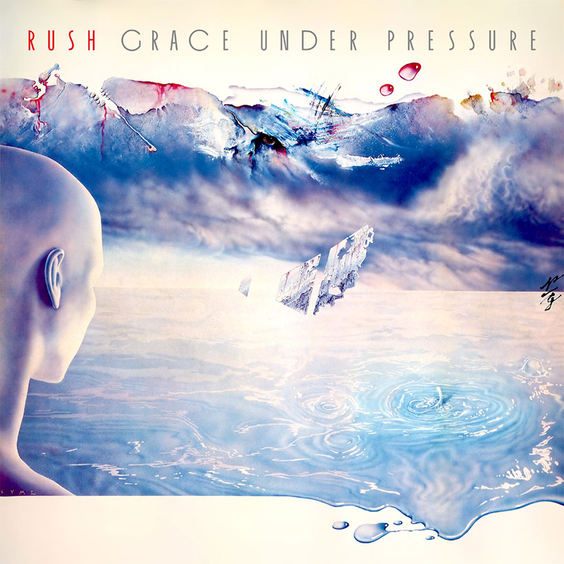
19. A painting wasn’t Syme’s first choice of sleeve image. The original idea was a photograph of an egg being squeezed in a clamp, reflecting the album’s title. The image ended up appearing on the inside cover of the original vinyl version.
17. The model for the painting on the cover of 1985’s Power Windows was Toronto waiter and punk fan Neill Cunningham, a friend of a friend of photographer Dimo Safari. Cunningham also appeared on the cover of soft rockers Honeymoon Suite’s 1986 album The Big Prize. These days he owns a record store, Pandemonium Books & Discs, in Toronto,
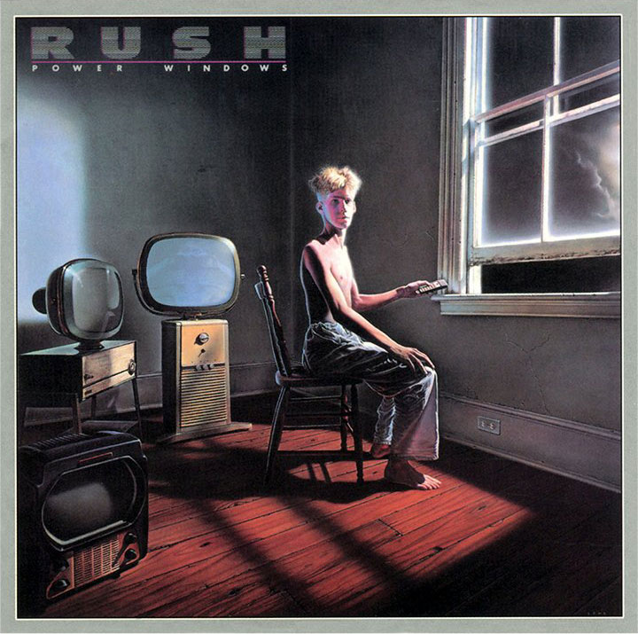
18. The TV’s on Power Windows were a late addition – Geddy Lee suggested Syme add them after he had already finished the painting. A creepy detail: the central TV, showing an image of Neill Cunningham from the back cover, isn’t actually plugged in.
19. Hollywood actor Dennis Hooper almost appeared on the cover of 1987’s Hold Your Fire. The Easy Rider star was due to play a juggler in a photo of an Easter Egg-packed street scene. Hopper bailed when another project came up and was replaced by Stanley Brock, who had appeared in Happy Days and Murder She Wrote. The photo eventually appeared in the CD booklet.
20: The three mysterious red-against-red spheres that appeared on the final Hold Your Fire sleeve? “Red billiard balls on a red billiard table,” according to Neil Peart.
21. The pool of water below the boy kicking a skull on the cover of 1991’s Roll The Bones was actually a 20-foot aquarium constructed in a former brewery especially for the shoot. The full pool can be seen on the original Roll The Bones ‘longbox’ edition.
22. 1993’s Counterparts was centred around the theme of duality and contrast – hence the diagram of a nut and bolt on the front cover. The symbolism was extended in the CD booklet: other images included hot and cold tapes, a hare atop a tortoise and a photo of the proverbial Three Wise Monkeys representing the old maxim ‘Hear No Evil, See No Evil, Speak No Evil – actually a single chimpanzee hired at great cost from an animal wrangler in Niagara Falls especially for the shoot.
23. The mohawked ‘punk’ crouching on a toilet in a photo on the Counterparts CD booklet is actually Neil Peart. Rush photographer Andrew McNaughton shaved the drummer’s head before the final show on the Roll The Bones tour (Peart surprised his bandmates by whipping off his bandana during the encore to reveal his new ’do).
24. The giant pile of stones on the cover of 1996’s Test For Echo was inspired by an Inuksuk – a symbolic statue-come-marker built by Innuit Indians – in the Canadian town of Yellowknife. Despite the trio tiny figures crawling across it, the actual model used on the sleeve is just 18 inches high and made of foam. It currently sits on a desk in Hugh Syme’s office.

25. Rush’s first album in six years, and the first since the death of Neil Peart‘s wife and daughter, the cover of 2002’s Vapor Trails featured a painting of a blazing comet, whose tail extended onto the back sleeve. “Neil told me that the comet represents life’s sparkle and fade,” says Syme in The Art Of Rush.
26. The photographs of the individual band members on the inside of the Vapor Trails CD booklet? They aren’t photos – they’re incredibly realistic paintings by Hugh Syme.
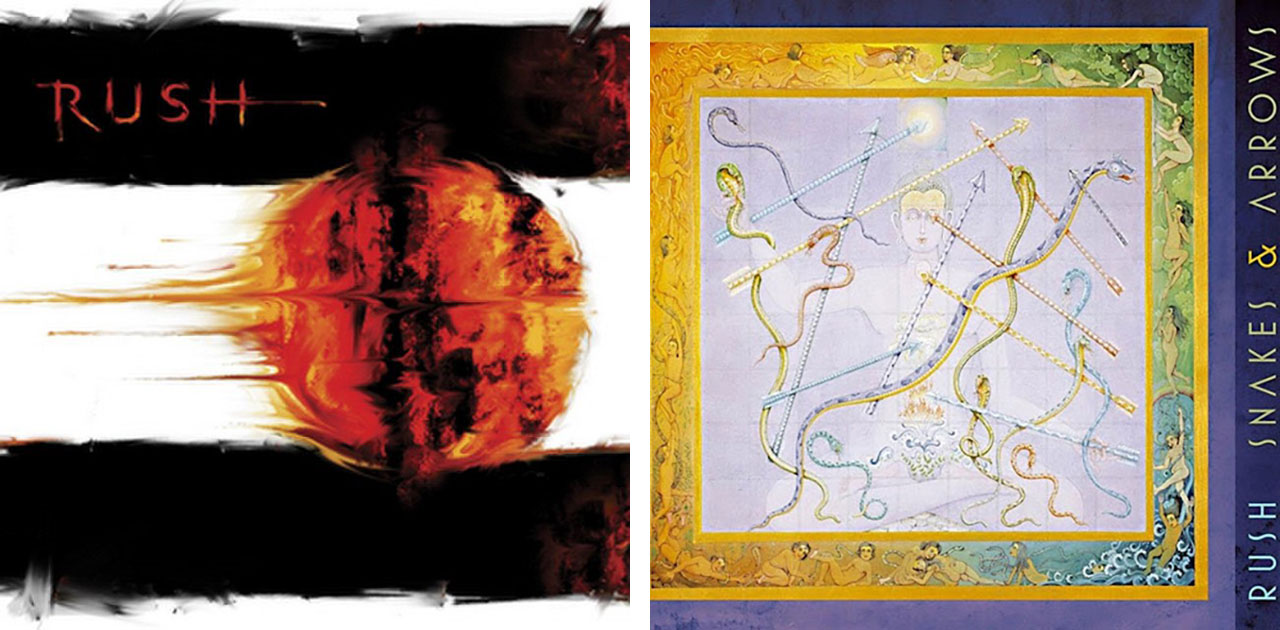
27. The cover of 2008’s Snakes & Arrows is a painting by 20th century Hindu scholar Harish Johari, inspired by 2000-year-old board game The Leela Of Self-Knowledge – the basis of Snakes & Ladders.
28. Inspired a photo Peart had taken of Route 66 in the Mojave Desert, Hugh Syme’s original cover idea for Snakes & Arrows was an image a baby crawling down a desert road past a road-sign featuring a snaking arrow, towards three giant arrows stuck in the ground – nod to the Twin Arrows Trading Post near Flagstaff, Arizona, where a pair of giant arrows are embedded in the ground. A variation of the photo – where the road-sign had been graffiti’d and shot up by bullets – appeared on 2008’s Snakes & Arrows Live.
29. The image of a battered pavement that accompanies the lyrics for The Larger Bowl inside the Snakes And Arrows CD booklet originally appeared on another Hugh Syme cover, Alice Cooper’s 1997 live album A Fistful Of Alice, while the angelic mechanic fixing a machine that accompanies the lyrics to Working Them Angels is taken from an actual 1920 photo of a man working on a steam pump, with feathers added afterwards.
30. The hands on the back cover of Snakes And Arrows belong to Syme’s 92-year Aunt Mary, a one-time concert pianist.
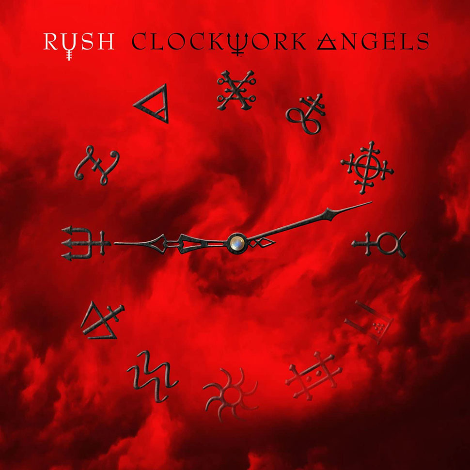
31. The hands of the clock on the front cover of 2012’s Clockwork Angels read 21:12, with the angle between them mirroring Michelangelo’s painting of Adam reaching out to God that adorns the ceiling of the Sistine Chapel. The numerals on the clockface themselves are a series of alchemical symbols, including copper, mercury, lead and gold, tying in with the album’s 12 tracks.
And one thing we still don’t know… Who the hell is the naked ballet dancer on the cover of Hemispheres?
