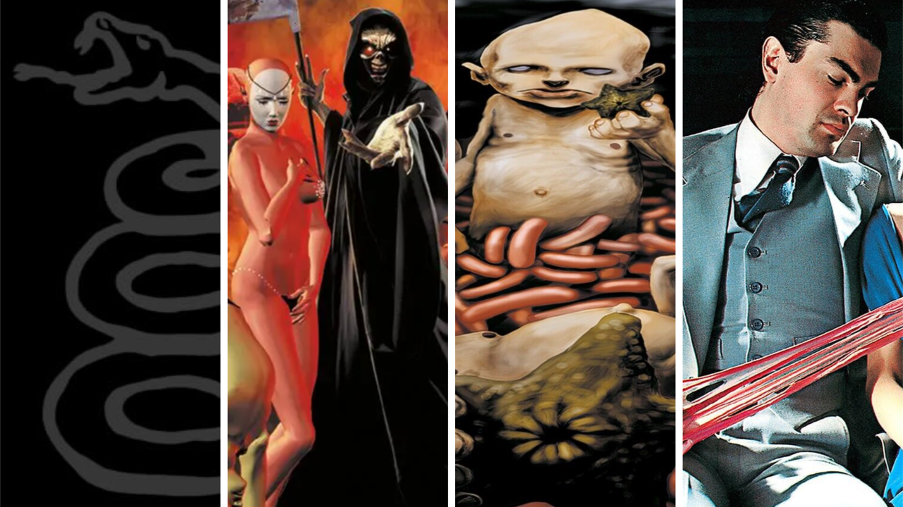
Despite many metalheads claiming that looks don’t matter round these parts, the truth is that a good aesthetic is a key aspect of a heavy band making it big. Putting Iron Maiden mascot Eddie The Head on anything will guarantee it sells, while so much of the buzz around Slipknot and Ghost has centred around their masked faces. Looking good won’t guarantee you success, but it’ll put you in the fast lane.
This is why it’s such a shame when masterful music gets sullied with imagery that just looks shit. Even the biggest bands have fallen victim to it, from Metallica to Limp Bizkit. So, below, Metal Hammer’s listed 10 times that amazing metal albums were burdened with some of the shoddiest album art to have ever been given a thumbs-up.

Metallica – Metallica (1991)
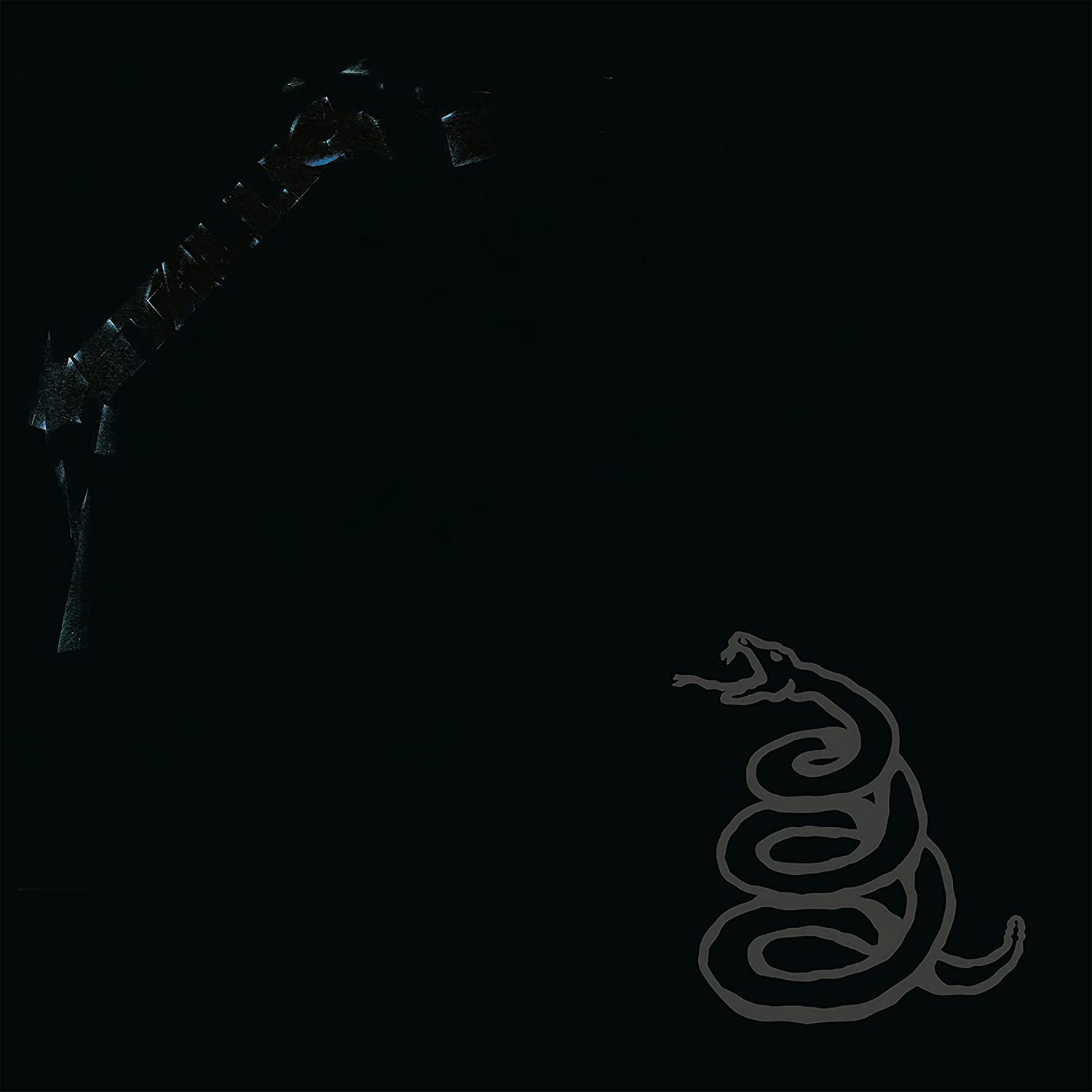
We get why The Black Album looks like this. Following the immense, progressive scope of …And Justice For All, Metallica wanted to make something simple: simple songs, a simple title and simple artwork. The subsequent music may have made the Four Horsemen the heavy metal band, but that cover’s atrocious. The concept of all-black art rips off a Spinal Tap joke from seven years prior, and the two images – the Metallica logo and the snake – are haphazardly arranged. Plus, thanks to that coiled serpent also appearing on the Gadsden flag, you can’t wear Metallica merch in public without someone assuming you’re a libertarian.
Iron Maiden – Dance Of Death (2003)
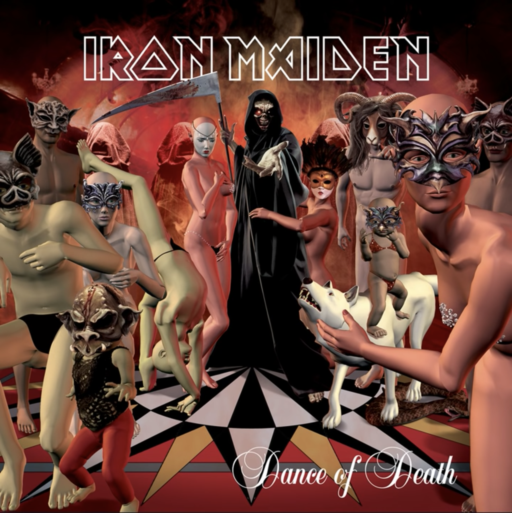
Normally the kings of heavy metal album art thanks to their mascot Eddie and artist extraordinaire Derek Riggs, Iron Maiden dropped the ball so hard in 2003 that it cracked the earth. The original Dance Of Death cover by David Patchett simply featured Eddie dressed as the grim reaper and standing on a roulette wheel. It was fine, if unimpressive by The Beast’s standards, but manager Rod Smallwood deemed it too empty-looking. He hired someone to add in a gaggle of CGI characters, and the result’s now been a joke for 20 years. Singer Bruce Dickinson called it “embarrassing” in his autobiography.
Black Sabbath – Paranoid (1970)
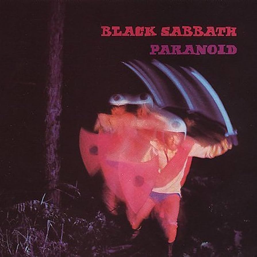
Containing such immortal tunes as Iron Man and the title track, Paranoid inspired multiple generations of metal bands and remains a well-aged masterpiece of the genre. That cover is dogshit though. To be fair to Black Sabbath, metal was still figuring out what its own sound and iconography were going to be back in 1970 – but no one could have really thought that a policeman wielding a cheap shield and getting shoved through several smear effects was “it”, right? It’s especially egregious when you consider that the front cover of Sabbath’s self-titled debut remains one of the eeriest in heavy music history.
Limp Bizkit – Chocolate Starfish And The Hot Dog Flavored Water (2000)
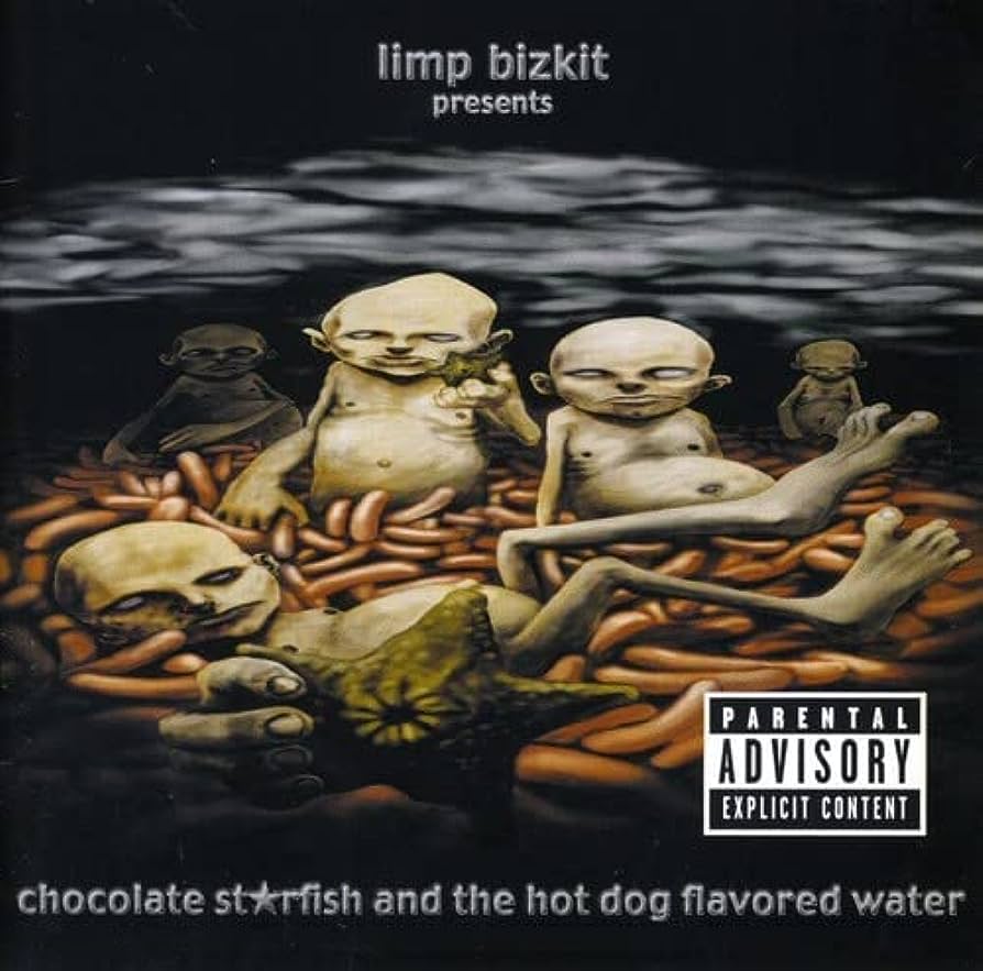
Chocolate Starfish And The Hot Dog Flavored Water is a crap title and, to the surprise of no one, it’s complimented by a crap cover. The art for Limp Bizkit’s third album is just ugly, from the foggy background to the dead-eyed babies and, of course, the sea creature with an arsehole getting shoved in your face. Turn-of-the-millennium audiences clearly didn’t mind, however, since Chocolate Starfish… swiftly became the quintessential Bizkit release. It charted at number one in 12 countries and contains such megahits as Take A Look Around, Rollin’ and My Generation.
Megadeth – Killing Is My Business… And Business Is Good! (1985)
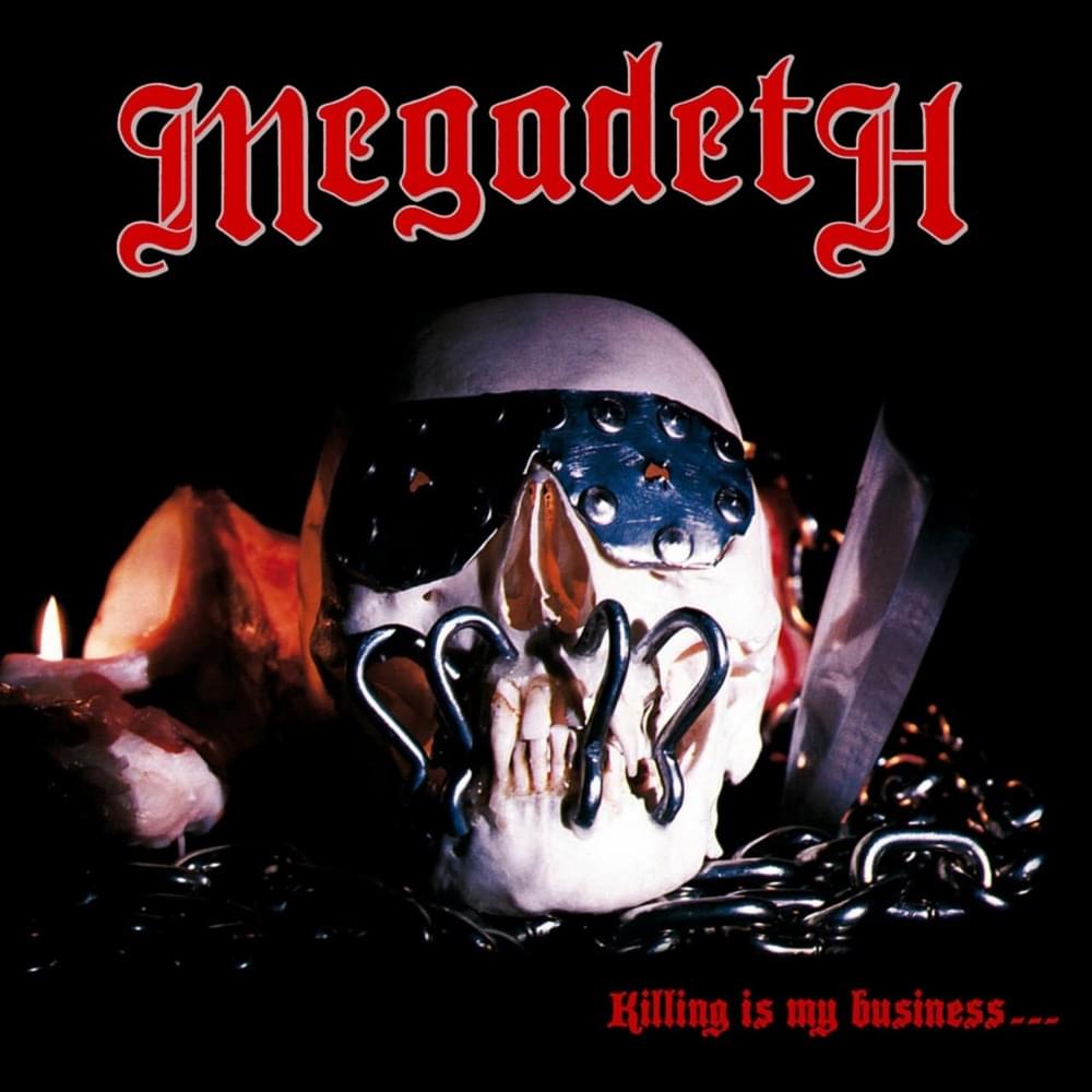
What do you think Dave Mustaine’s first reaction to this was? After being fired from Metallica in 1983, the Megadeth main man began a campaign of vengeance, vowing his new band would be faster and more successful than his ex-colleagues. Then their debut album – a manifesto of fury and speed – was adorned by a cheap plastic skull covered in tin foil and ketchup. Somehow, Combat Records fumbled this: the plan was for a Mustaine sketch of mascot Vic Rattlehead to be the cover, until the label… lost it? Or something? It’s never been properly explained, but at least Killing… got the artwork it deserves on its 2002 reissue.
Scorpions – Virgin Killer (1977) / Lovedrive (1979) / Animal Magnetism (1980)
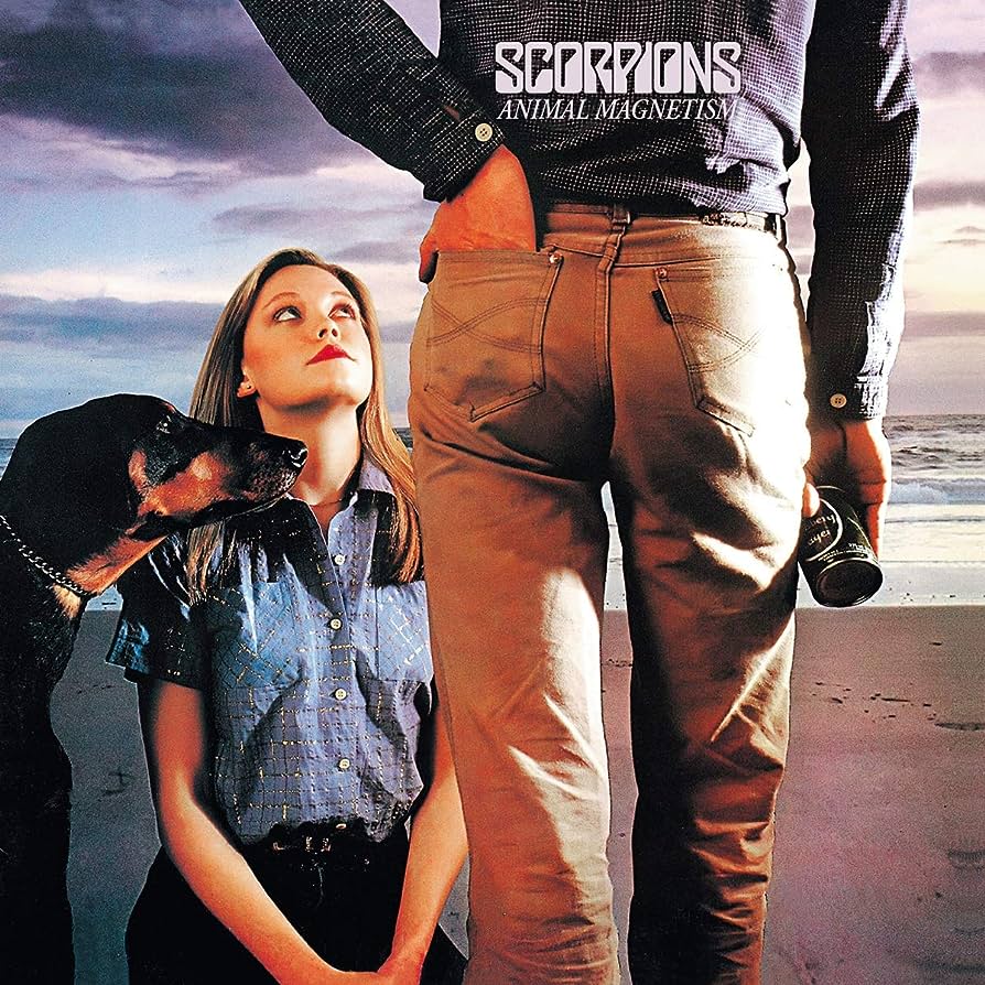
Here’s a triple dose of terrible for you. German hard rockers Scorpions were on the up-and-up in the late 1970s, finally beginning to sniff chart success before their ’80s material catapulted them into the mainstream. You’d never guess looking at the artworks they used. Although Scorpions had never had a good album cover by ’77, Virgin Killer marked a new nadir, featuring a nude prepubescent girl in a provocative pose. It’s disgusting. Lovedrive and Animal Magnetism are less horrific, but the images of a man having his hand stuck to a breast like chewing gum and a dog examining a bloke’s crotch still aren’t great, are they?
Anthrax – Fistful Of Metal (1984)
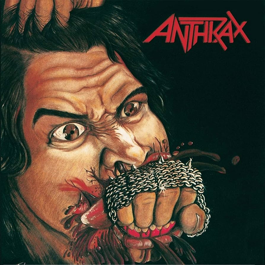
Without Anthrax’s debut album, thrash metal would not be called thrash metal. It was in reference to the Fistful Of Metal track Metal Thrashing Mad that the late Malcolm Dome coined the term, and now it’s the descriptor for the most successful form of extreme metal there ever was. However, the artwork really didn’t signpost that this is a band who’d make an impact. What was supposed to be a painting of a fist flying through a face ended up looking more like a weak uppercut that left the victim not distressed and scarred, just a bit miffed.
Exodus – Bonded By Blood (1985)
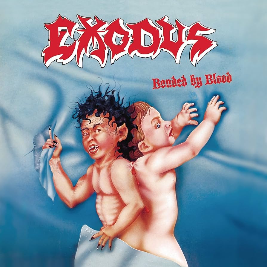
Before Metallica, Slayer and Anthrax, there was Exodus. The OG thrash metal aggressors were formed in 1979 by a fresh-faced Kirk Hammett, but didn’t get to make their debut until 1985 – by which point all of the Big Four had pipped them to the post. Bonded By Blood is still a cult favourite, and its sonic brutality was supposed to be backed up by a cover depicting a field of dismembered body parts. But then the label got cold feet and we received two conjoined twins tearing themselves apart. It’s just as violent as what was scrapped, yet also much shittier-looking.
Voivod – Dimension Hatröss (1988)
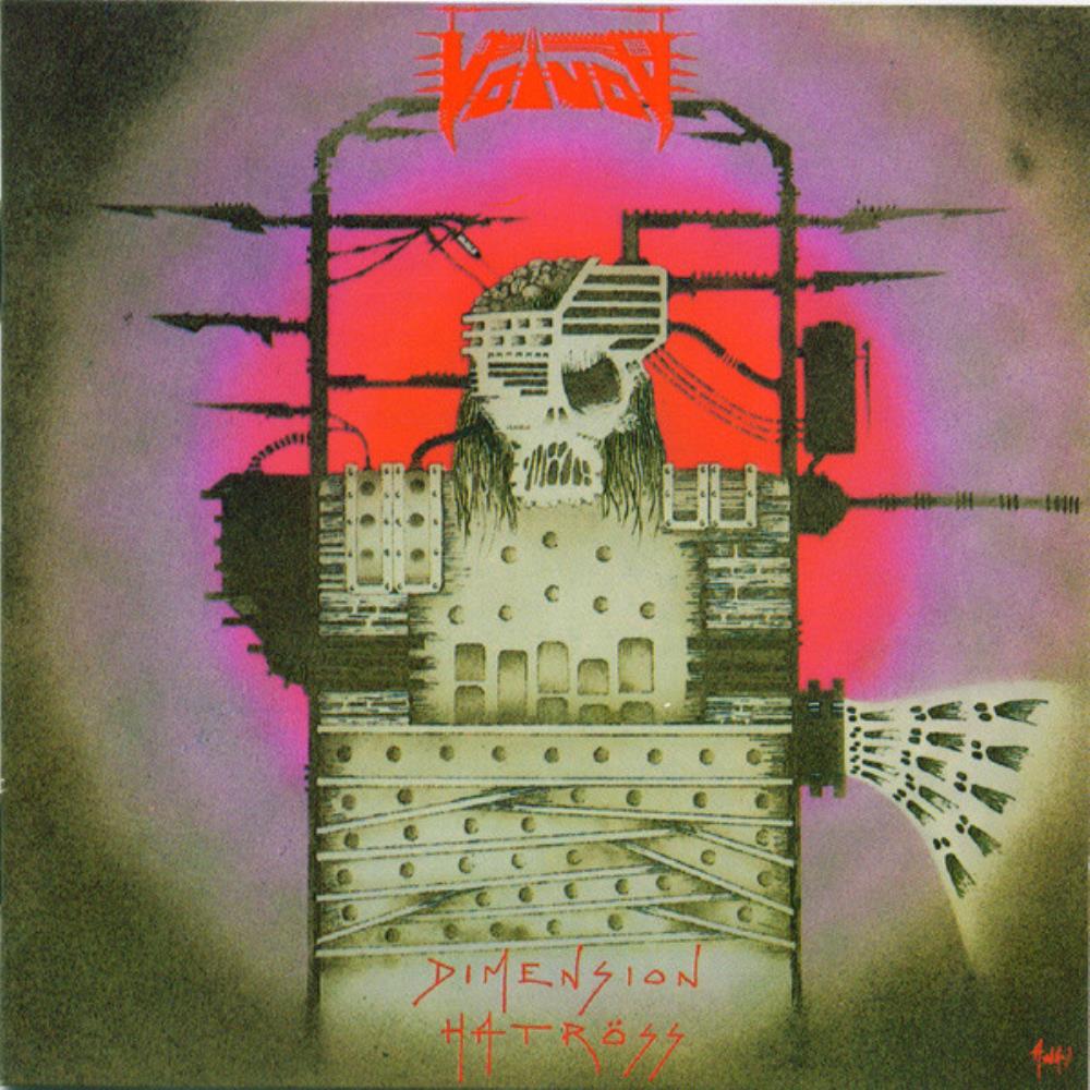
“Thrash bands using hideous front covers” is becoming a bit of a thing, isn’t it? Dimension Hatröss is the album that saw Voivod fully ditch speed metal convention and push further into a particularly incomprehensible flavour of prog. But, what didn’t change was that the artwork was once again done by drummer Michel “Away” Langevin and – sorry mate – you weren’t good at this sort of thing back then. Imagine covering your magnum opus with a lame “dystopian” drawing worthy of little more than your school sketchbook. At least Away nailed the cover of follow-up Nothingface, which is some I Have No Mouth And I Must Scream-esque nightmare fuel.
Brutal Truth – Sounds Of The Animal Kingdom (1997)
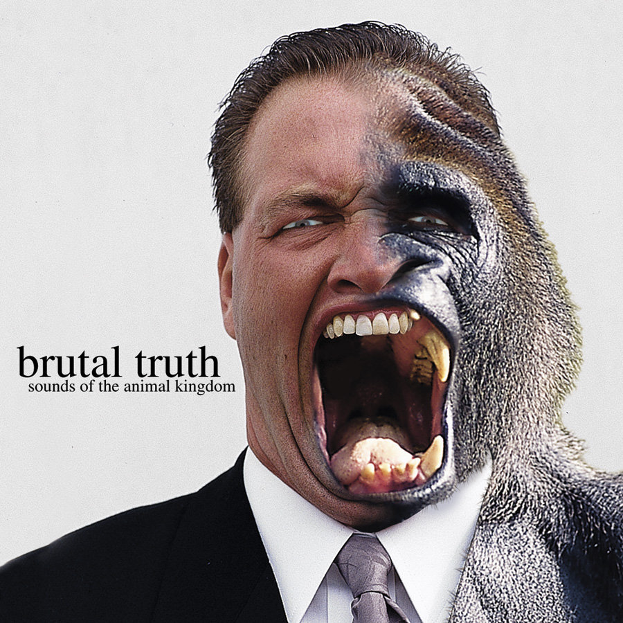
Who knew that that “reject humanity, return to monke” meme was actually pioneered by a grindcore band in 1997? Brutal Truth, despite being a supergroup formed by ex-Anthrax bassist Dan Lilker, never got the attention they deserved – and the artwork of Sounds Of The Animal Kingdom doesn’t exactly make the uninitiated want to give it a whirl. It’s a photo of some Arnold Schwarzenegger lookalike “turning into” an ape in what’s possibly the worst spliced image our eyes have ever been cursed with. It’s a crying shame, considering Sounds… is an inventive masterpiece that considered devolution and the apocalypse years before Cattle Decapitation got round to it.
