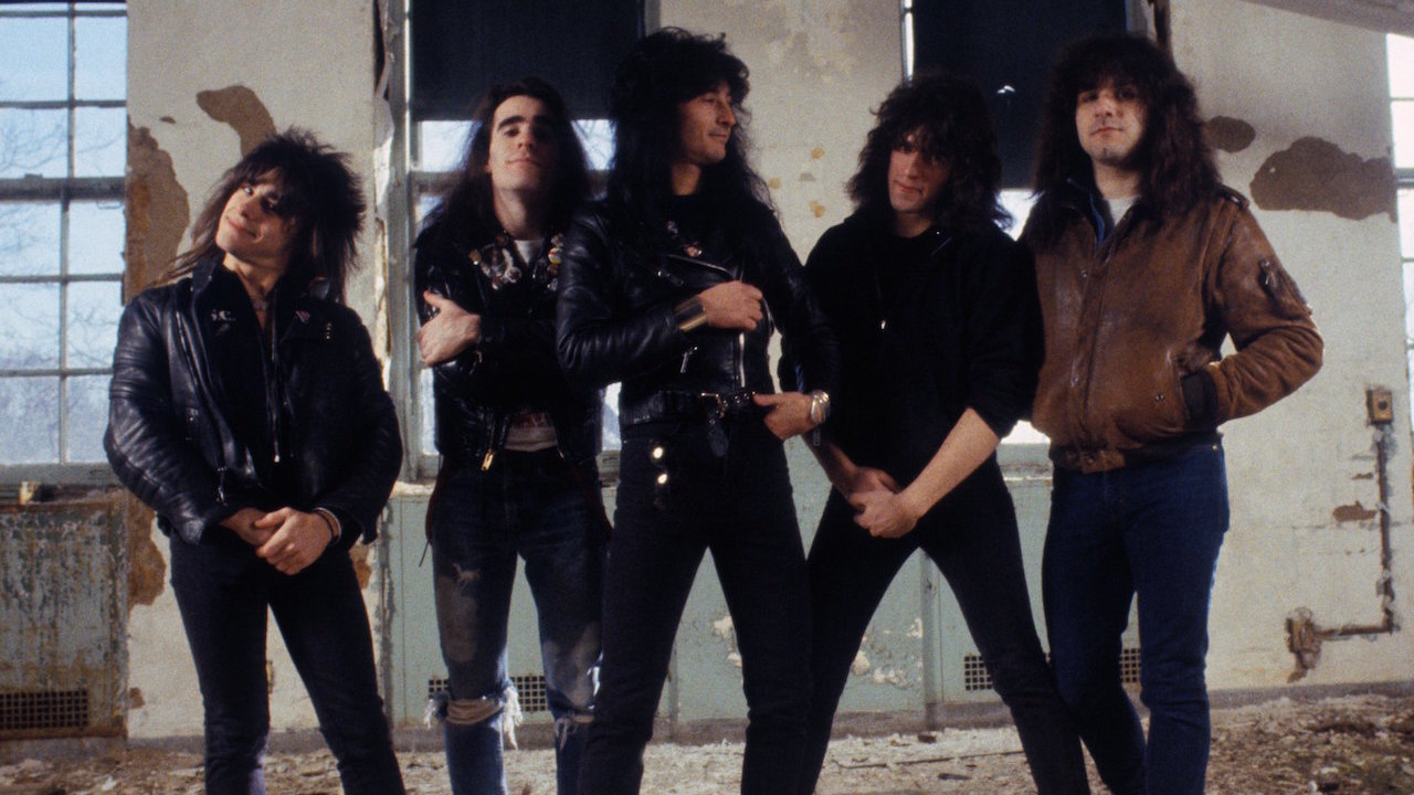
Unlike Slayer, Anthrax have always had a huge amount of input into their cover art, especially drummer Charlie Benante. Seizing control of the band’s aesthetic after the widely-ridiculed Fistful Of Metal sleeve, Benante has conceived, overseen and approved every image the band have since stamped their name on, tracing an artistic line from the garish excesses of the 80s, through the moody, minimalist 90s, to the hip superhero likenesses and ‘Pentathrax’ insignia of their post-millennial graphic design. In 2016 Charlie told Artist Direct “That’s one of the reasons I still take the time and effort to make an album cover: I want our audience to get lost in it.” Here are the stories behind every Anthrax sleeve…
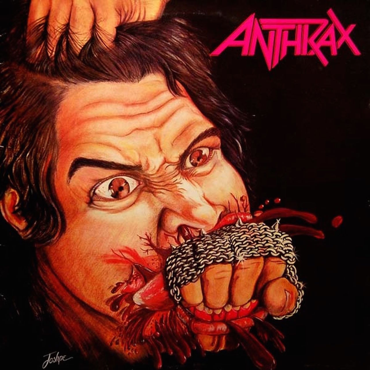
Fistful Of Metal (1984)
“The cover was all wrong, but we didn’t have the budget to do anything else,” admits Scott Ian in his 2014 autobiography I’m The Man. The notorious sleeve was conceived by short-lived frontman Neil Turbin (whose homemade glove is depicted on the fist) and painted by a friend of guitarist Dan Spitz, who clinched the job when he designed the band’s iconic logo. It often ends up in ‘worst cover of all time’ lists, a status the band agreed with, although Scott says he’s grown fonder of it over the years “just because it’s so goofy”, reasoning “all the big thrash debut albums… had terrible covers.”
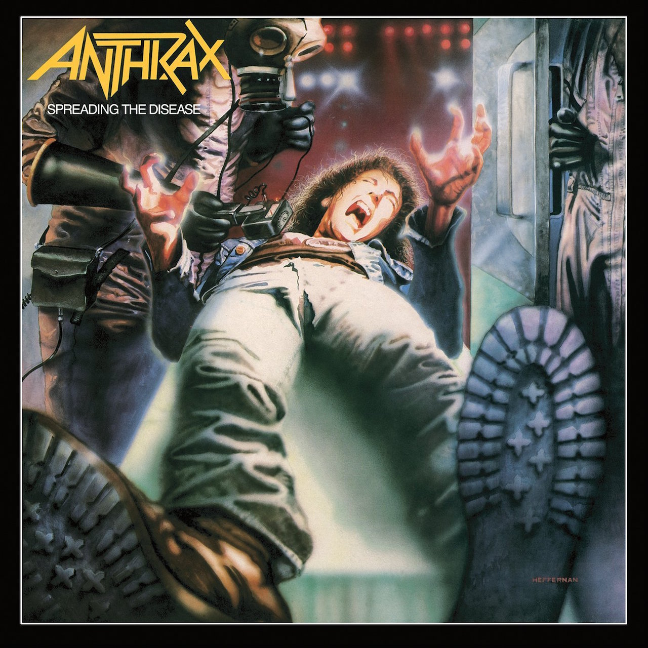
Spreading The Disease (1985)
Boasting surely the most famous sneaker soles in heavy metal history, the cover art for Spreading The Disease was produced by designer Peter Corriston and illustrator Dave Heffernan. Ten years earlier, these men had worked on Led Zeppelin’s design classic Physical Graffiti sleeve, so clearly the band had learnt lessons from the amateurism of Fistful Of Metal. As with most subsequent covers, the concept came from drummer Charlie Benante, and it’s never been confirmed if the agonised metalhead being checked for radiation levels is a deliberate likeness of the band’s new bassist, Charlie’s nephew Frank Bello.
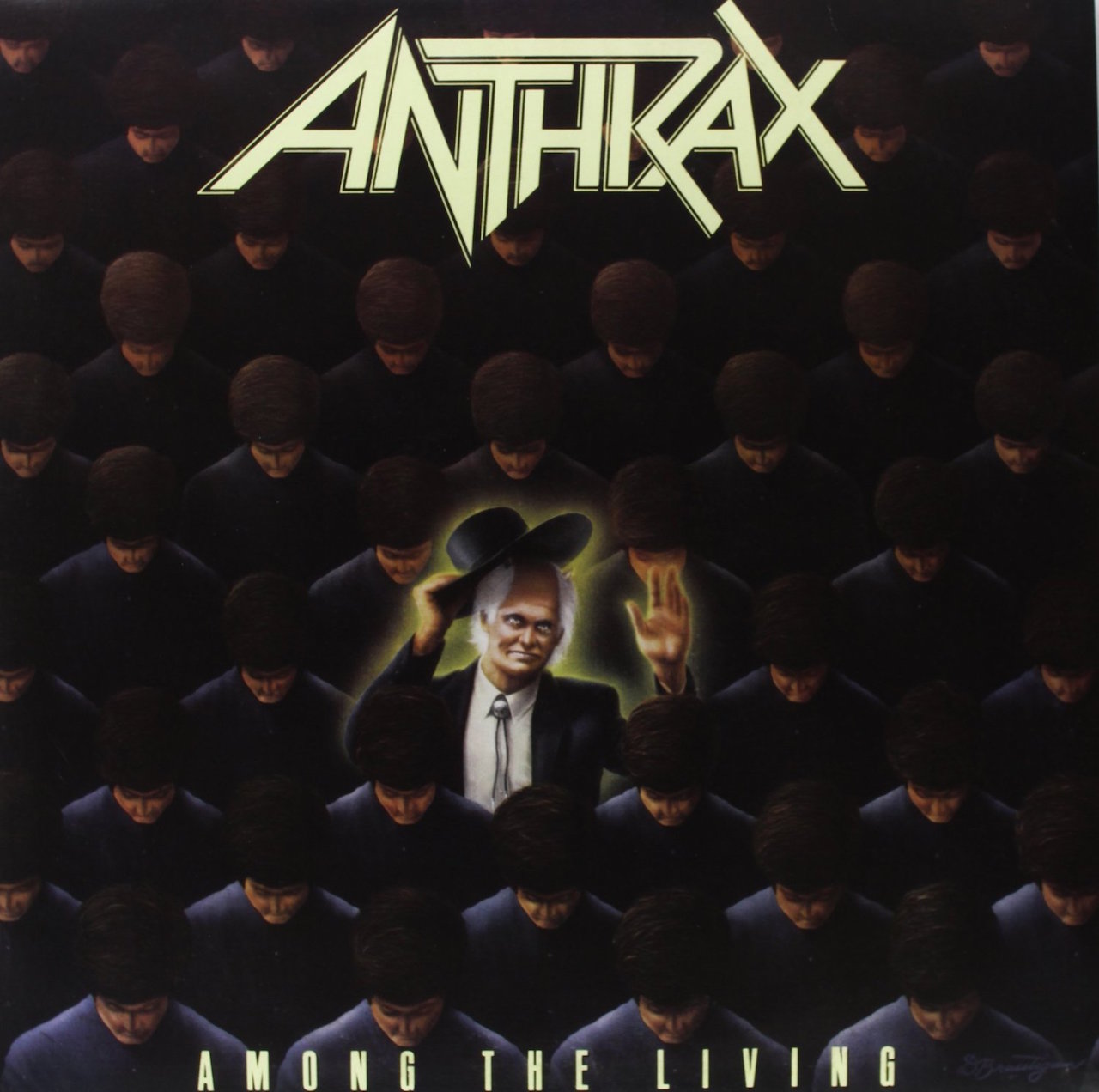
Among The Living (1987)
Always one of the more opaque 80s thrash sleeves, this was the first of three covers by Don Brautigum, who previously painted Metallica’s iconic Master Of Puppets. This ambiguous image of a preacher peeping out from a faceless herd always had a subtly unnerving quality, perhaps because the figure resembles the evil priest from the previous year’s Poltergeist 2. “Poltergeist had a very strong visual image to me and I liked the way it looked,” Charlie explained to PureGrainAudio. “I was always into horror, and Among The Living was basically about good and evil. It was just about how much evil there is amongst us.”
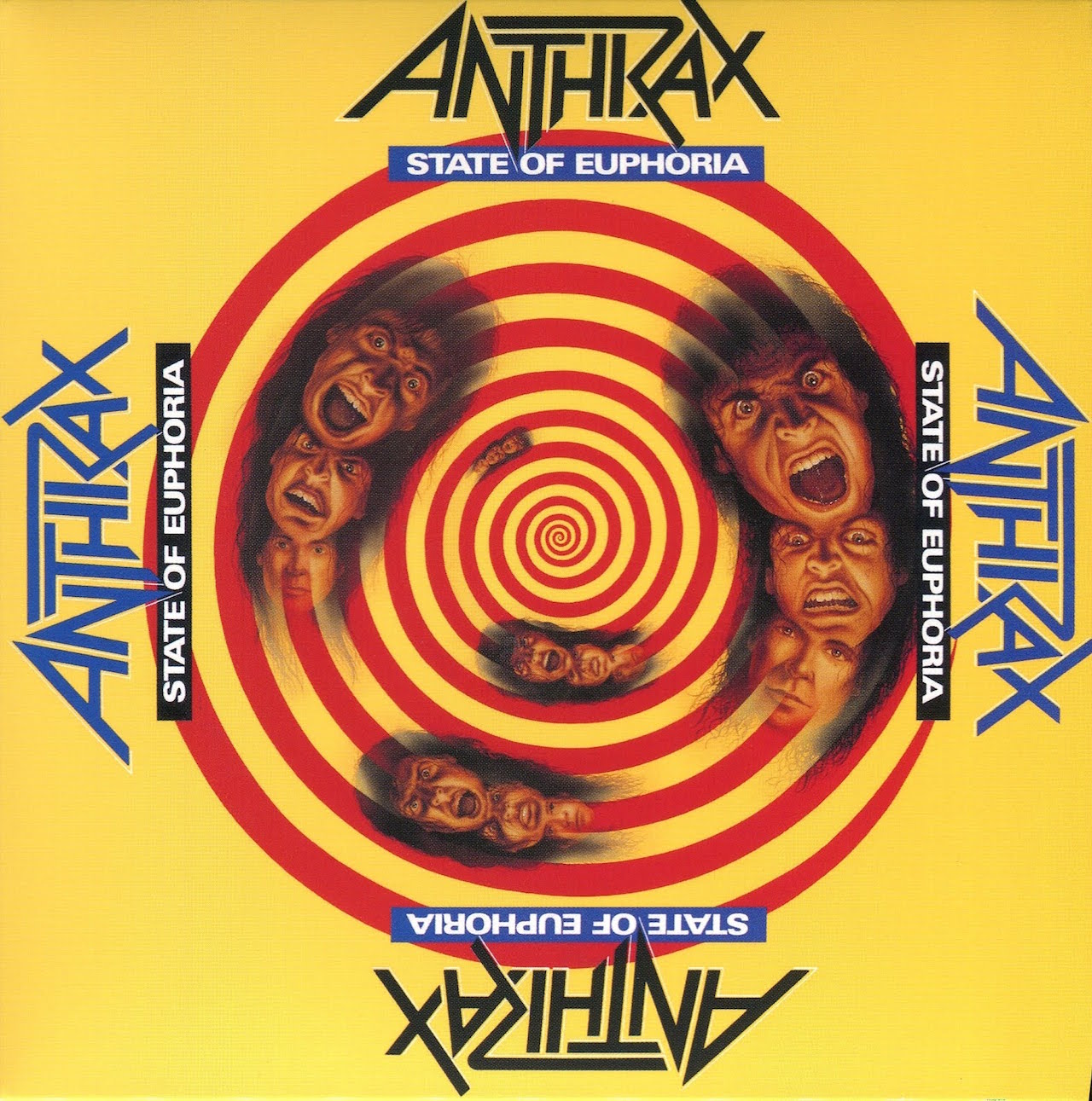
State Of Euphoria (1988)
By 1988 Anthrax had introduced Bermuda shorts and comedy hip-hop to the thrash scene, so nobody batted an eyelid when they fearlessly released a canary yellow record. The Live Auctioneers website sold the original artwork in 2004 (it sold for its starting bid of $1000), claiming “It features portraits of the band over a red spiral.” Although the spinning metalhead certainly resembles Joey Belladonna, it’s again not clear if this was deliberate. This sleeve hasn’t got the best reputation, but the four-way logo and title - making the sleeve work whichever way up it’s held - is a neat touch.
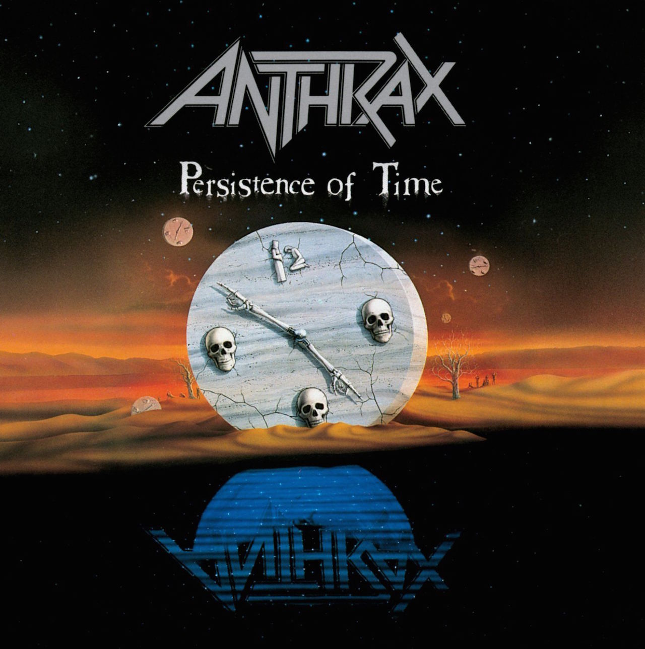
Persistence Of Time (1990)
Don Brautigam again, here providing a complete contrast to the primary-coloured simplicity of the last sleeve with some cool, dark and complex conceptual surrealism, with aesthetic nods to The Twilight Zone opening titles and a paranoiac-critical rendering of the number 12 out of hooded figures. There are three levels: the black night sky, the dusty arid landscape studded with clocks made of skulls and bones (which formed the 1991 stage set), and the beautiful rippling blue reflection of the band logo hatching out of the moon. Arguably the best-realised and profound artwork in the Anthrax canon, it perfectly signals the greater depth and darkness of the music within.
- The top 10 best Tool songs
- 10 albums that prove 1986 was the best year for thrash
- 1986: Metallica, Slayer, Megadeth and the year thrash broke
- Every Metallica album ranked from worst to best
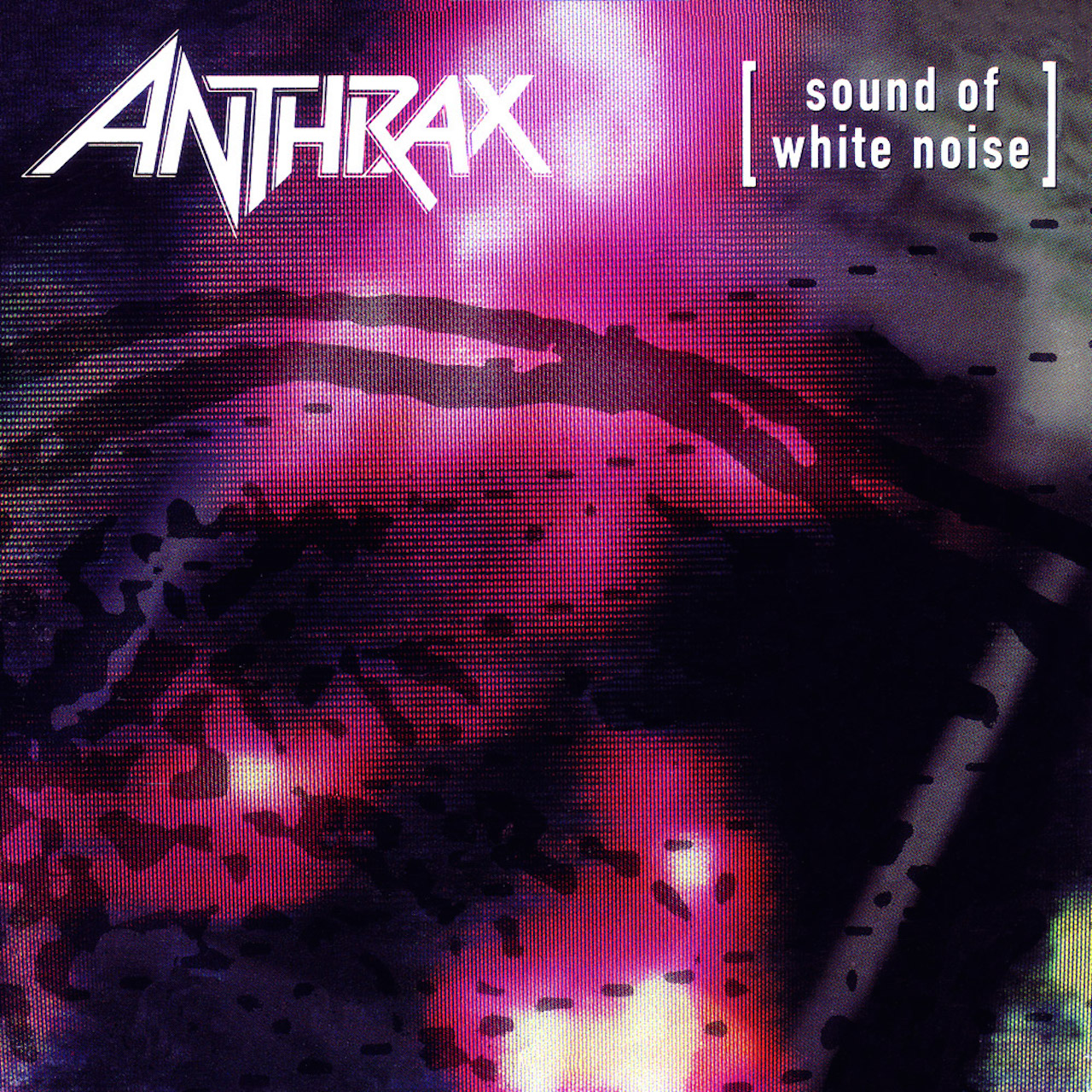
The Sound Of White Noise (1993)
By 1993, metal - and Anthrax - were changing, a fact signalled by this intriguing, misty alien blur of colour and shape, apparently denoting a blob in a jar. A limited edition CD came with a skull design integrated into the blob, but the image remains enigmatically indistinct. Longtime Ministry collaborator Paul Elledge’s grainy photography of 405-line TV screens and analogue static proliferated across the band’s aesthetic in 1993, rolled out across the album inlay, two singles and an Elledge-directed video for the single Only.

Stomp 442 (1995)
70s sleeve art supremo Storm Thorgerson originally designed this for Bruce Dickinson’s solo debut Balls To Picasso, but having just left Iron Maiden, Bruce couldn’t afford it (he went with a toilet wall instead). According to Bruce’s bassist Chris Dale, Thorgerson “had a quarter of a ball of scrap metal made, then rotated it with a crane and compiled the multiple shots.” It’s a compelling image, but not very Anthrax; neither’s the new logo, a ripply stoner rock font paying sad testament to a time when spikes were frowned upon. Incredibly, Walmart banned the sleeve from stores, presumably because there’s a tiny nude man’s arse on it.

Volume 8: The Threat Is Real (1998)
With the CD format restricting the canvas of sleeve art, the cover everyone knows for this mid-period curios is merely a detail of a much wider, more glorious image. The inlay folds out to reveal a War Of The Worlds-style movie poster of the band screaming at giant spider-legged robot 8-balls laying waste to a city, with soldiers on fire and explosions, which is terrific: “Every man their prisoner… Every woman their slave!” Artist Tim Gabor’s prolific portfolio includes work with Foo Fighters, Disney Magazine, and an audiobook of Tom Thumb read by John Cleese, with music by Elvis Costello.
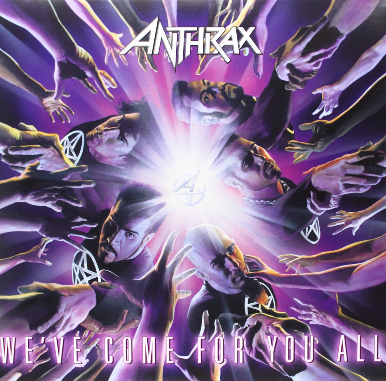
We’ve Come For You All (2003)
The first Anthrax sleeve to be painted by comic book artist Alex Ross, who’s kept the gig as band artist right up to their latest album, even while maintaining a dizzying work rate at Marvel and DC and multiple other empires. Superman, Batman, Spider-Man, Wonder Woman, Captain America, the Incredible Hulk, Scott Ian – Ross has done them all. “He did the amazing job as he turned all of us into superheroes,” Scott said in 2003.

Worship Music (2011)
The tiny ‘Pentathrax’ motif at the centre of the last cover has become a shimmering golden portal, and the arms of adoring fans have become the shrivelled limbs of zombies and mutants. According to Alex Ross, the central circle was originally a turntable playing a record with the logo on it, but the band later stamped the enlarged insignia into the middle of the swarm. Kerry King wasn’t happy about Anthrax’s late adoption of the pentagram: “You don’t just take up pentagrams 20 years into your career,” he fumed. “These guys never had pentagrams before, what’s up with that?”
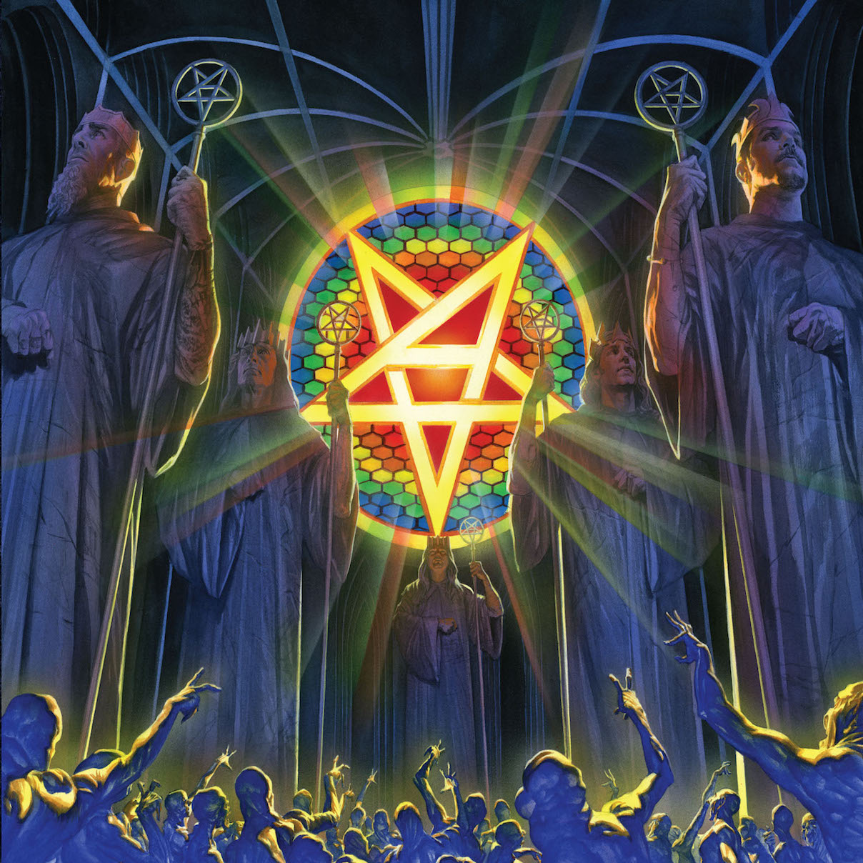
For All Kings (2016)
The music-worshipping freaks from the last record sleeve are back, crowding into a vast hall dominated by the glowing Pentathrax set into honeycombed stained-glass, flanked by giant marble effigies of the crowned imperial bandmates (the muted pre-release teaser sleeve depicted the statues in darkness, which many preferred). “It’s beautiful, it’s grandiose, it just has this beautiful look to it,” enthused Charlie, who added that Alex Ross was “probably one of the greatest artists living.” A striking use of colour and scale, the image proved divisive among fans, the more irony-challenged of whom were concerned by its “megalomaniac aspect”.
