Larry Freemantle remembers Dream Theater being “very hands on” when it came to the cover of their second album.
IMAGES AND WORDS - DREAM THEATER
(Atco, 1992)
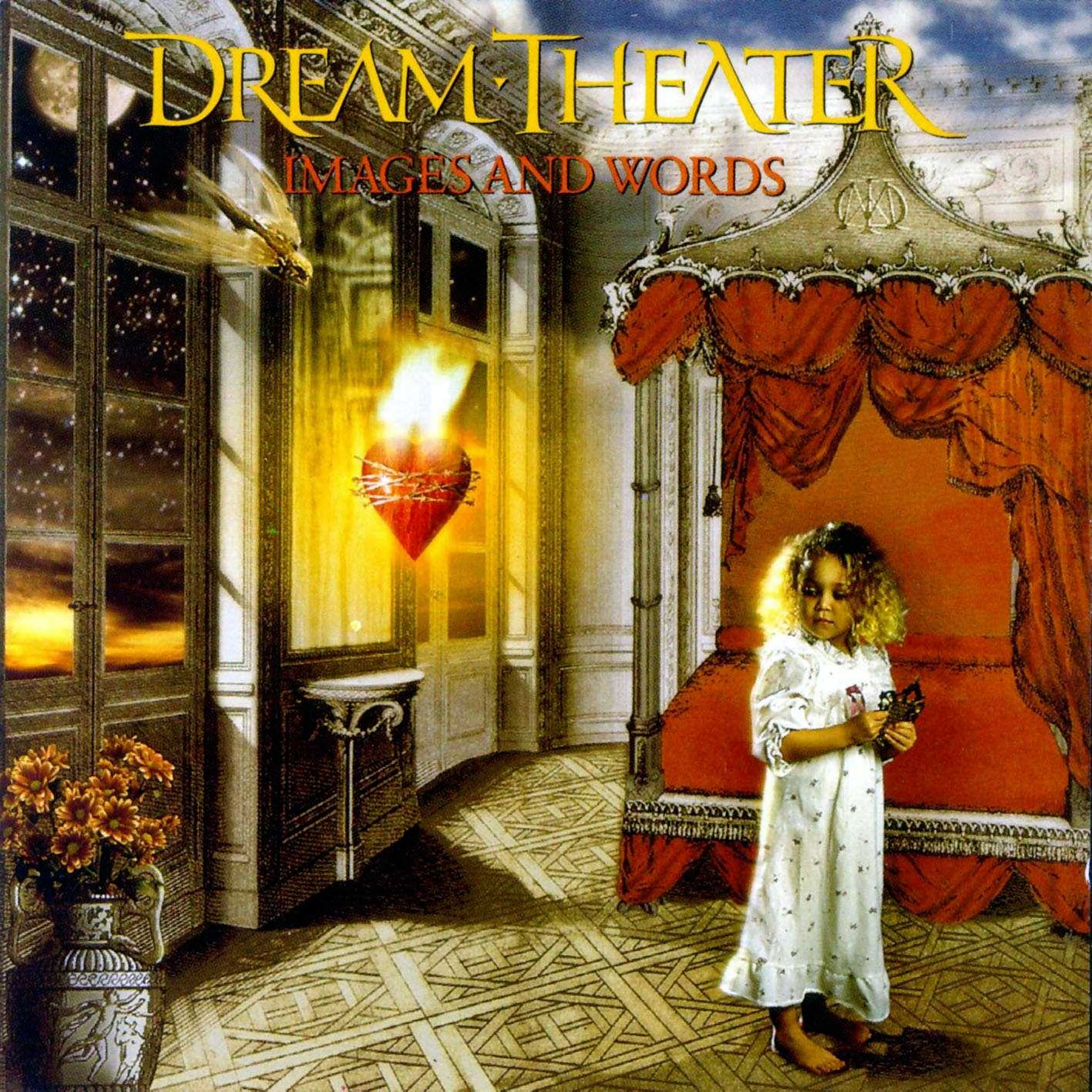
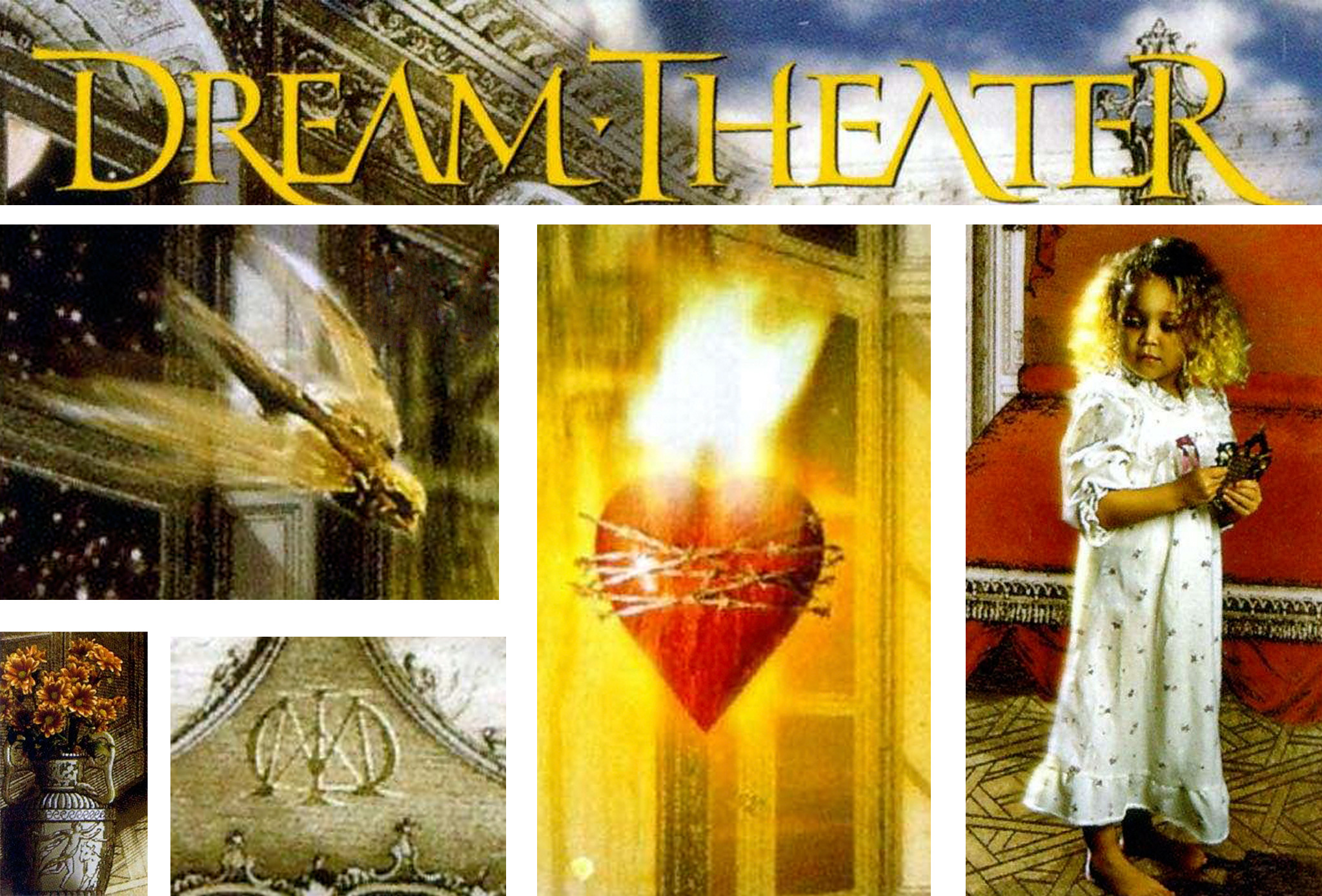
Dream Theater may have released an overlooked debut in 1989, but it wasn’t until they recorded Images And Words three years later that they achieved any notable breakthrough. Containing the unlikely hit single Pull Me Under, which was heavily rotated on MTV and commercial radio, the album would go on to sell in excess of 500,000 copies in the US alone. The record also contained other tracks which would soon become live stalwarts, such as Metropolis Part 1, Another Day and Surrounded. The distinctive artwork, depicting a girl alongside a number of themes that appeared in the lyrics, was created by Larry Freemantle.

How did you get involved in the project?
“At the time they were with Elektra, and at that time they didn’t really have an art department. I was with Atlantic and was assigned it like any other project. They had some company they were somehow connected with called Access Images. It was a pre-computer graphics time, and everyone was just getting into computer work. Access Images was one of those companies that did that sort of stuff, before Photoshop became huge. And they had a few people that worked there, so I sort of oversaw that project.”
**How did you come up with the idea? **
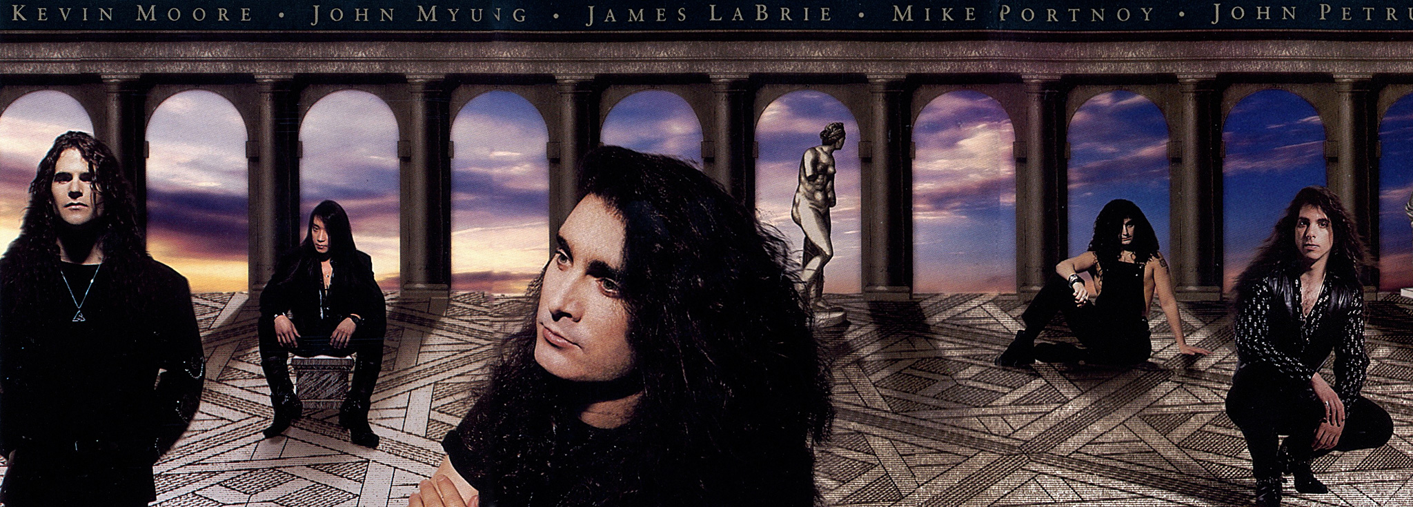
“The concept of what was on that cover came from the band. I tried to make it look compositionally like an old painting from a design point of view. I remember I met with the band and we sat down and went through everything. They were very hands on in the early days. John Myung was probably the key person I met along with John Petrucci. Kevin Moore and Mike Portnoy were also very much involved too. They were very specific about what should be where on the sleeve. It was just a matter of trying to piece it together. So they wanted a little girl, they wanted the bird flying and that style of room. It was a collage of engravings and illustrations which I thought was pretty cool. The engravings and the room were from old engravings book that we spliced together, and the sky was worked into it too. As for the font, I had that created and hired a calligrapher, John Stevens, as I wanted it to be personalised and to look like a type font.”

Stylistically, it’s reminiscent of some of the 70s album sleeves. Is that something that you were conscious of?
“Those guys and myself were huge Hipgnosis fans and that it’s pretty obvious. And in fact, later on they actually used Storm Thorgerson to do some the art for their Falling Into Infinity album. I’m a big fan of how that stuff was done pre-computer. The sleeve is a little dated now, simply because you can see how well things are done today. So I look back and think that I could have done it in so many different ways. Those Hipgnosis phenomenal sleeves are beautiful and haven’t dated, and I suppose Images And Words holds up to some degree. I like the fact that it is a collage rather than, say, it being all photographic.”
Who was the girl who features on the cover?
“The girl was somebody that the photographer, Dan Muro, chose and I think he just cast someone for that. It wasn’t anybody specific for the band. I remember that the flaming heart logo was physically created, and they made a model of it and then photographed it.”

How were the band to work with?
“The guys were down to earth and from Long Island, where I’m from, and we were the same age. They were easy going and it’s always easier to work with a new band than someone who has been around for a long time. In the beginning they were so happy just to be doing some of the stuff we were doing, and it wasn’t a big budget job. They were a very serious and professional band right from the start. A lot of bands are like the deer in the headlights when it comes to ideas so their attitude was quite unusual. They were always great when they came to the table as they always had ideas.”
