“Clutching At Straws was not one of my best efforts back in the day, it has to be said. There were mitigating circumstances, mostly due to time. Far too much of it at the beginning, as the band were unsure about how this cover was to be approached or even if I would be doing it, and we all seemed to drift for ages. The enthusiasm at the meetings about previous album art was sadly absent. This was a dark album in all sorts of ways, everyone at the time could sense it. The cover needed to reflect that somehow. It certainly was my darkest hour as an artist!
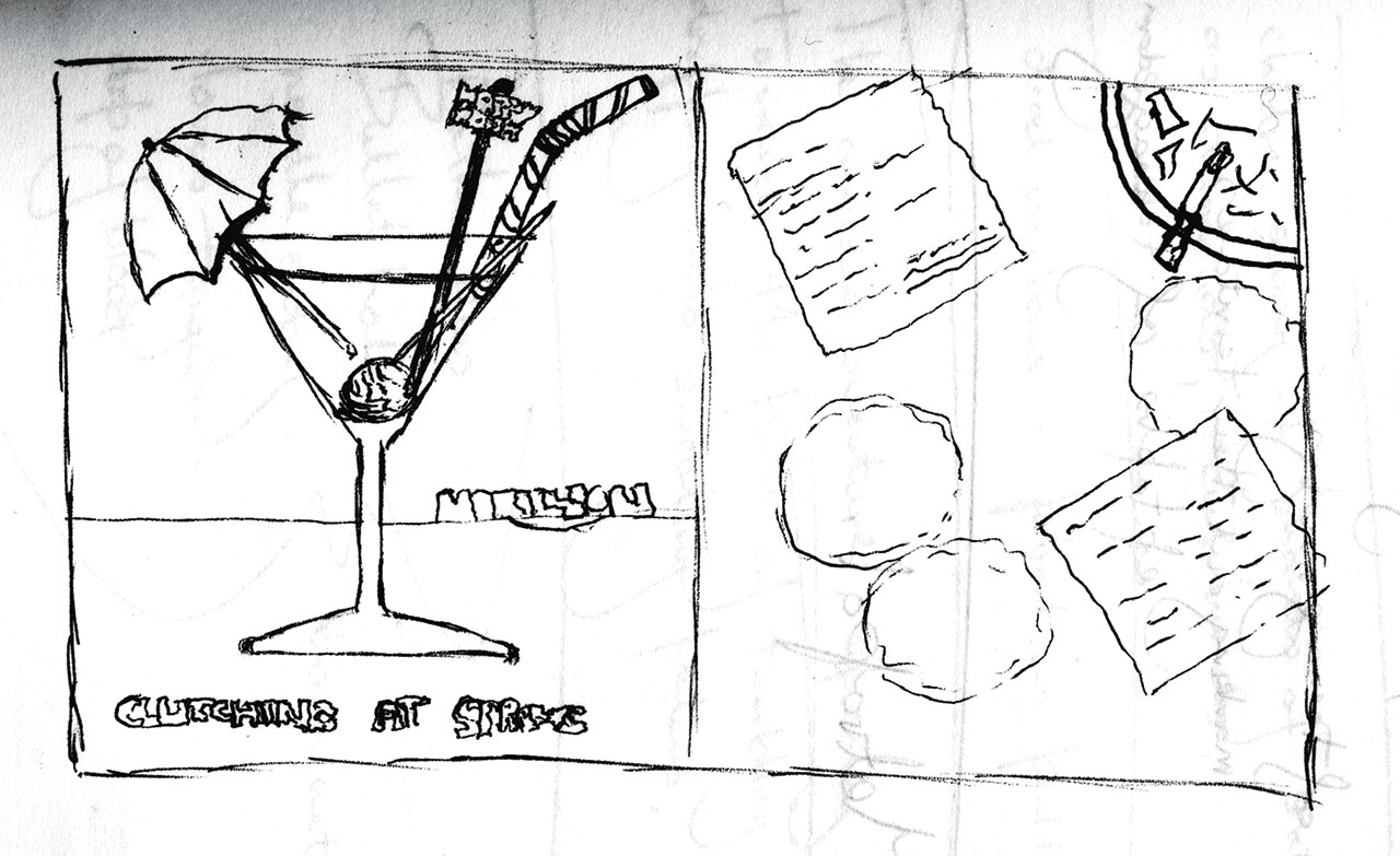
Initially, Fish provided me with a doodle based on a cocktail glass with planet Earth skewered instead of a cherry. But I don’t think the rest of the band went for it, so a meeting was set up at EMI to explore other ideas. We discussed featuring a bar. To accentuate the different stylistic approach to previous albums which was important to them, I suggested a collage, mixing photography and painting. The next time we met, I brought along Janus Van Helfteren, a photographer I knew. The basis of this cover art would be a black and white photo of a dingy, spit and sawdust bar, which would certainly look different to the brightly coloured trilogy of album covers that preceded Clutching. I proposed having the drinkers airbrushed as realistically as possible on paper, then cut out and pasted on to this photo. I had got the idea from a book I really liked by artist Guy Peellaert who had airbrushed the cover for Bowie’s Diamond Dogs. He had created mixed media collages with the rock elite painted on top very effectively for Rock Dreams – an illustrated history of the first 30 years or so of rock’n’roll.
Fish suggested a brotherhood of poets, artists, writers, comedians and rockers to populate the bar. Various names were put in the hat: John Lennon, Robert Burns, Truman Capote, Lenny Bruce, Dylan Thomas, Jim Morrison, Janis Joplin, Tony Hancock and most importantly, Jack Kerouac. It was a quote from his seminal book On The Road that inspired Fish when he wrote this album: “…the only people for me are the mad ones, the ones who are mad to live, mad to talk, mad to be saved, desirous of everything at the same time, the ones who never yawn or say a commonplace thing, but burn, burn, burn like fabulous yellow Roman candles…”

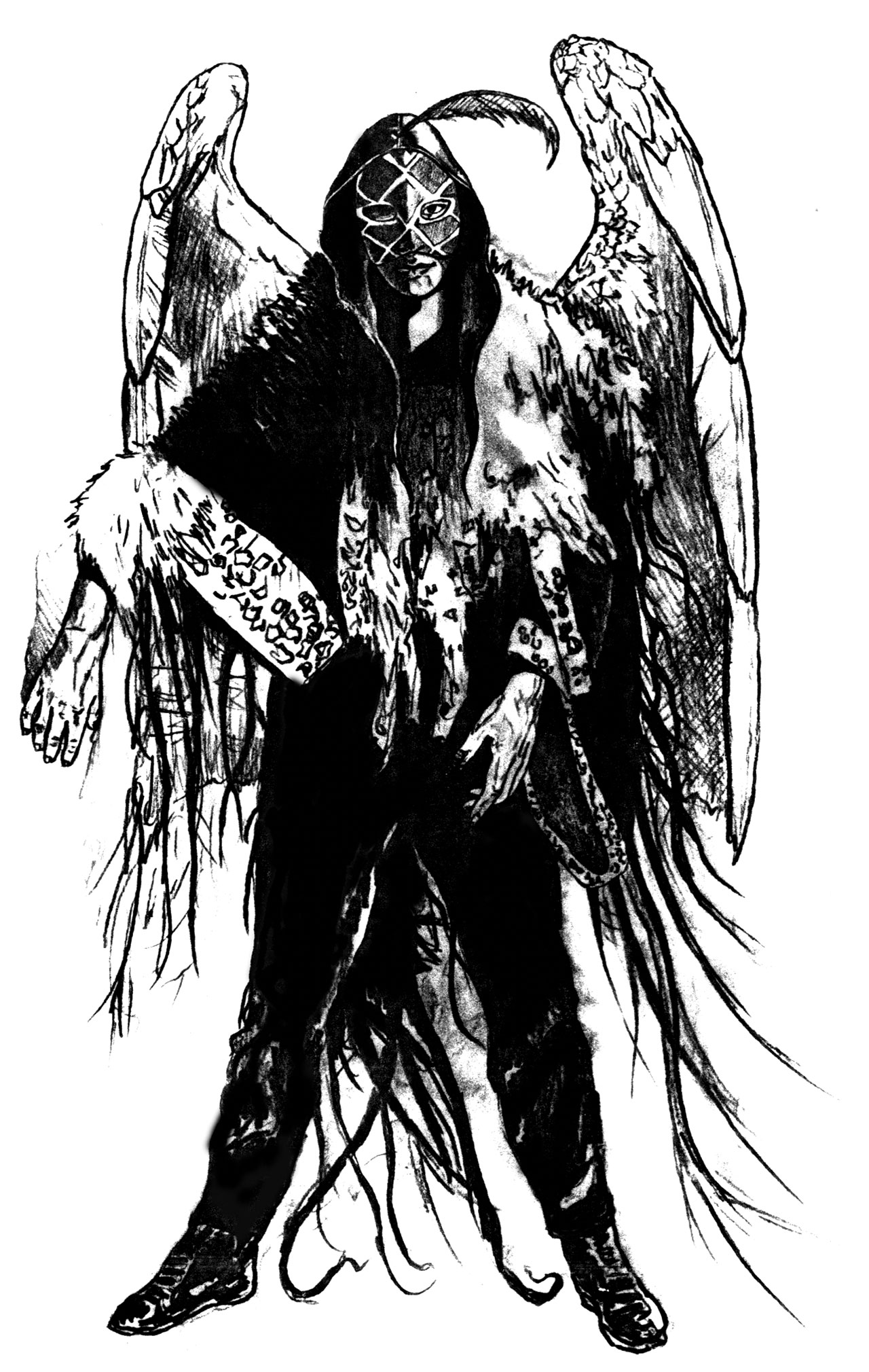
Later, while I was trying to piece all this together, the band’s manager rang me with something else to consider: a black angel.
I saw in Torch, the silvery-haired guy at the end of the bar, a possibility – an antihero to embody some of the album’s lyrical themes, like an alcoholic’s guardian angel.
We set up a photo session in Colchester at The Bakers Arms, which was most definitely a pub of ‘character’, with afternoon lock-ins, one of which we took over, with some of the bemused local drinkers looking on. Trouble was, it was quite a small place, so plonking all those people on Fish’s list inside would be… challenging. Janus and I sat the band at the back, leaving empty stools, chairs and tables dotted about for me to collage the drinkers in place later. That was my plan, and it was a good one. It should’ve been relatively simple.
The double whammy here was the complex nature of the brief escalating every week, with Torch changing from angel to being weirdly garbed, barefoot in a long coat with the jester’s hat in his pocket as a nod to the past! More characters were suggested, more detail to consider yet the timing was drastically cut short to accommodate an upcoming tour to promote the album. I had the manager and record company calling me on a daily basis for a progress report, warning me that if I was late with delivery, the album would be put back, cocking up their schedule. It made for a very uncomfortable ride as we’d all taken far too long discussing what this cover should look like that I had run out of time to make it actually work! My frustration is all too evident in the finished album art.

I used the futurist Russian poet and playwright Vladimir Mayakovsky as my model for Torch for no other reason than I liked his thousand-yard stare! I have no idea what was going on with that coat of his or the jeans; I think something was mentioned to me about having his clothes wet, appearing out of pools of water, and that his coat should reflect the outside world. In any event, Torch was rendered too quickly and looked awkward. I did my best with the limited time I had, but must accept responsibility for not project managing this far more effectively and saying no once in a while.
Prog asked me if I would consider reworking Clutching At Straws for the 30th anniversary, to finally make some sort of sense of it. What could possibly go wrong!? That forced perspective in the original bar photo was damned tricky then to overlay the figures, and that problem remains. I’ve had to play around with the laws of perspective a bit. I’ve knocked the three black pillars out of the bar, which in reality means the ceiling would cave in, but who cares? I’ve got all the characters in this time, plus a few others. Torch is better realised; I hated the crude way he was done before. It’s closer in spirit to what I think this album was all about.
In my opinion the chapter of my time working with Marillion is now closed in a more satisfying way.”

