If you pick up Metal Hammer issue 282 you’ll be greeted by the a fresh take on Iron Maiden’s iconic mascot, Eddie, but where did that image come from? The exclusive design was created for Hammer by renowned illustrator Dan Mumford who has worked with everyone from Lord Of The Rings to Star Wars.
Dan Mumford is no stranger to the world of Iron Maiden having already collaborated with the band for their Acme Print series. So we asked the man behind the art how the cover you see in stores came to fruition – from original sketches to fine details.
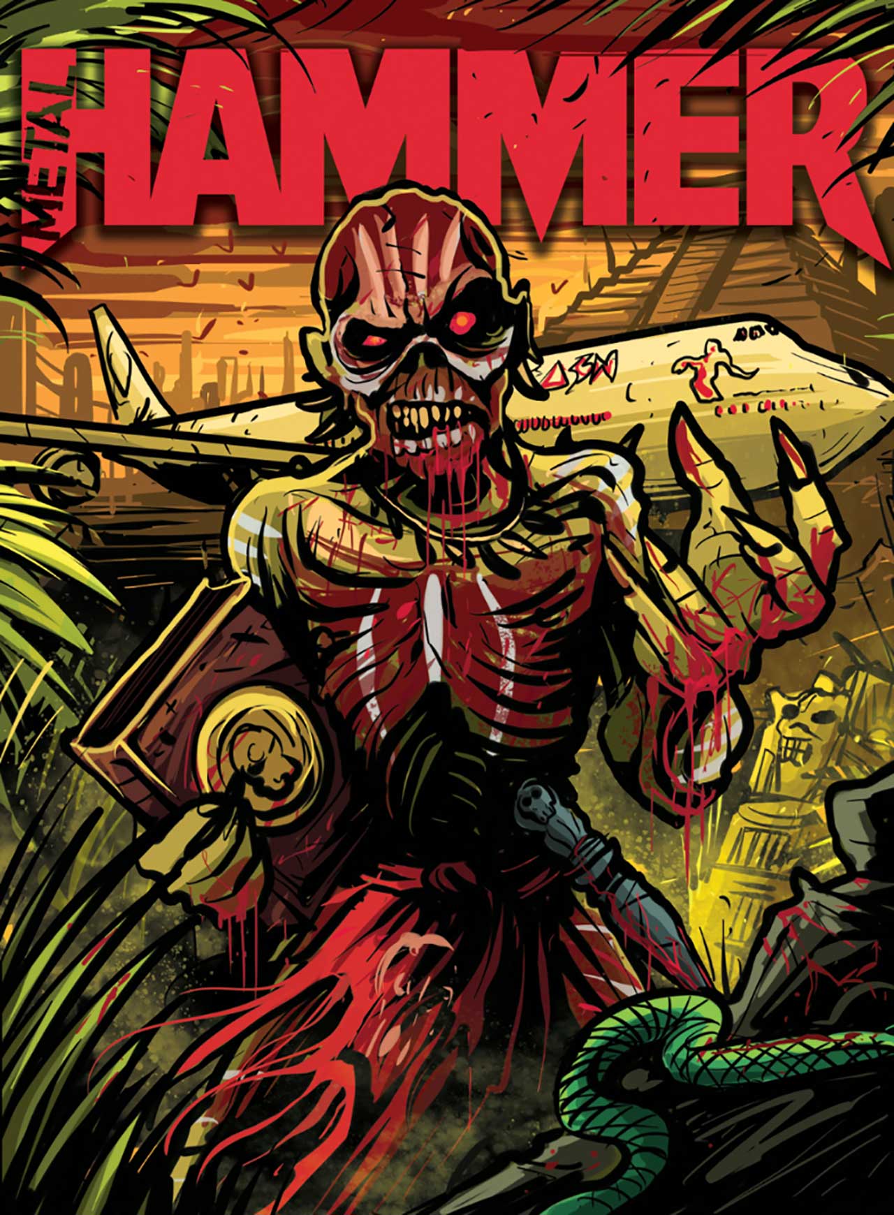
“This is the sketch we started with, taking into account everything the Metal Hammer team were looking for and also keeping Eddie front and centre whilst also somehow getting Ed Force One in there. Lots to pack in, but ultimately this composition worked nicely whilst also allowing lots of room for type to be added on the cover where necessary.”
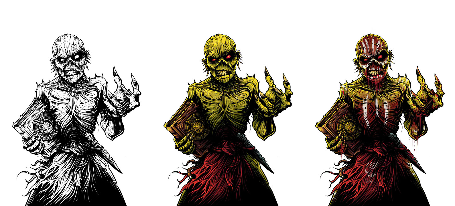
Left Eddie: “Initial lines for Eddie. This is always how I start most illustrations to try and get the best balance in the image with the shadows. Generally if an image works in black and white first then it will probably work up really nicely when I add in colour and shading.”
Middle Eddie: “I don’t do a lot of work with full colour, a lot of my work is based in screen printing, which means I am normally limited to just 3-5 colours. But here we have full colour, so to start with I added in colour to Eddie to just make a base ‘naked’ Eddie before adding in the textures and paint on his body.”
Right Eddie: “This is where it gets quite fun – we have the base Eddie ready to be messed around with. I added in some nice gory textures to muck him up and give him the rough messy look he has on the Book Of Souls cover and inserts. Alongside this of course, there’s some nice dripping blood and the white paint on his body.”
“The reason I created Eddie as a whole on his own first was so that I could make some foreground elements that could then be moved around to fit to the text, whilst underneath we would have a full Eddie and no missing parts of him. It just allows the Metal Hammer team more freedom when finalising the cover. Simple elements, but they all add a lot of extra depth to the image.”
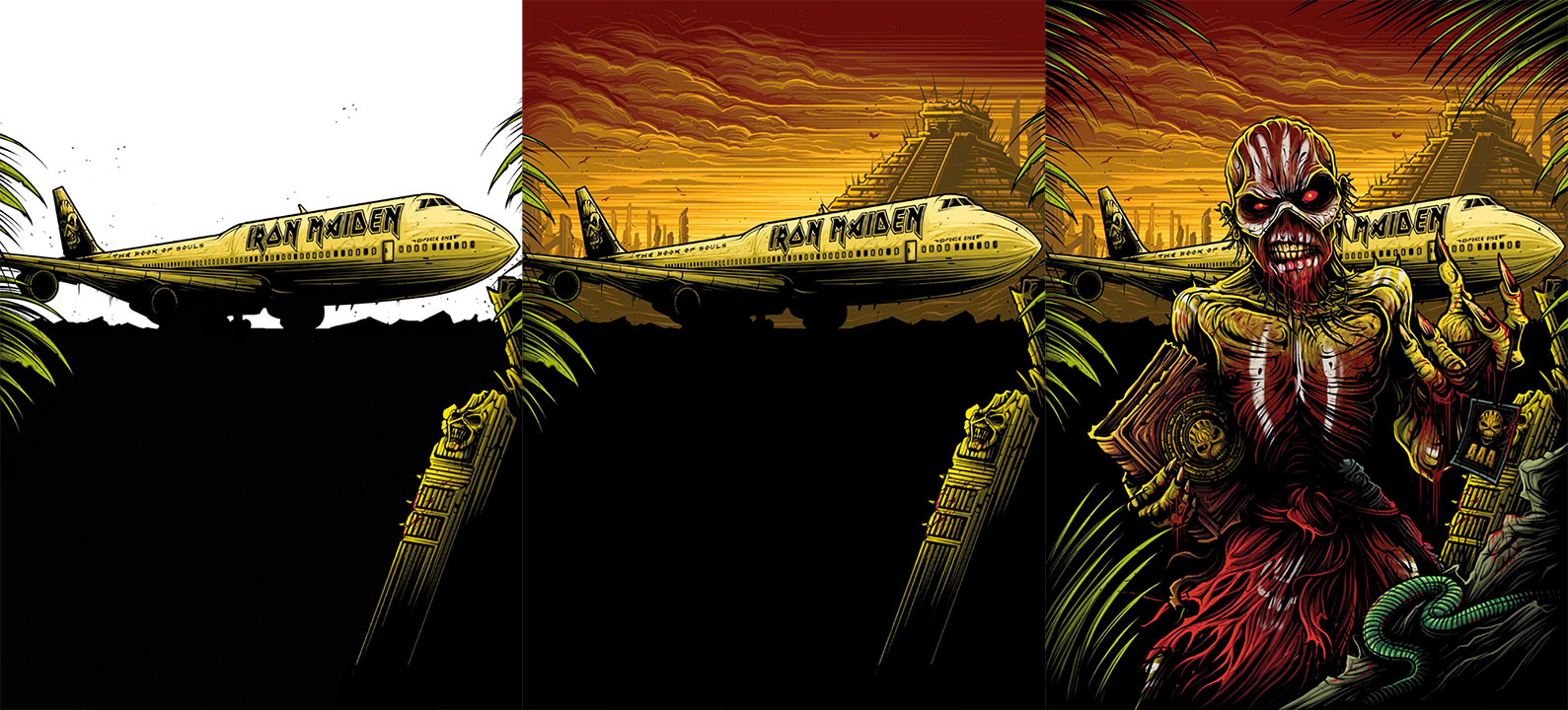
Left Image: “Here I created the background in full on its own so that if Eddie needs to be moved around we won’t have any missing imagery behind him. I tried to make this quite simple behind as to not distract from the foreground too much, but also make sure Ed Force One is nice and recognisable.”
Middle Image: “Finally we have nice bright sunset sky to offset all the greens in the foreground and give a nice warm glow to everything – a simple but effective way to make the foreground pop.”
Right Image: “Then here we have all the final elements sitting together, nearly finished…”
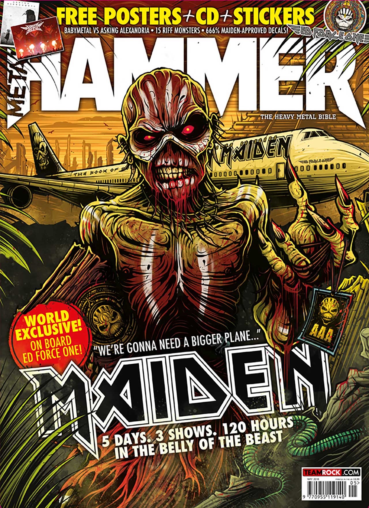
“I wanted to give more depth to the whole image and make it seem a bit more misty and mysterious, so I added in some nice smokey watercolour style textures to add an extra layer to the whole image. It really brings it all together and brings us to our final cover.”
You can buy the new issue of Metal Hammer here and check out more of Dan’s work at his official site.

