“I had worked with them on the Wish You Were Here tour,” British illustrator Gerald Scarfe recalls of his involvement with Pink Floyd, “and Roger Waters and I got on pretty well. We had the same ironic/sardonic view of the world and we played a lot of snooker. I think he trusted me.
“From my point of view, it was a happy arrangement,” Scarfe says of working onThe Wall sleeve, “because Roger in no way tried to impose himself on my work. He had the philosophy that if you employ an artist, you don’t try to change what he does. We were working in separate fields – music and art – and yet the two helped one another. He saw the whole sleeve as being designed by me, but it was Roger’s idea from the beginning that it should be a blank wall.”
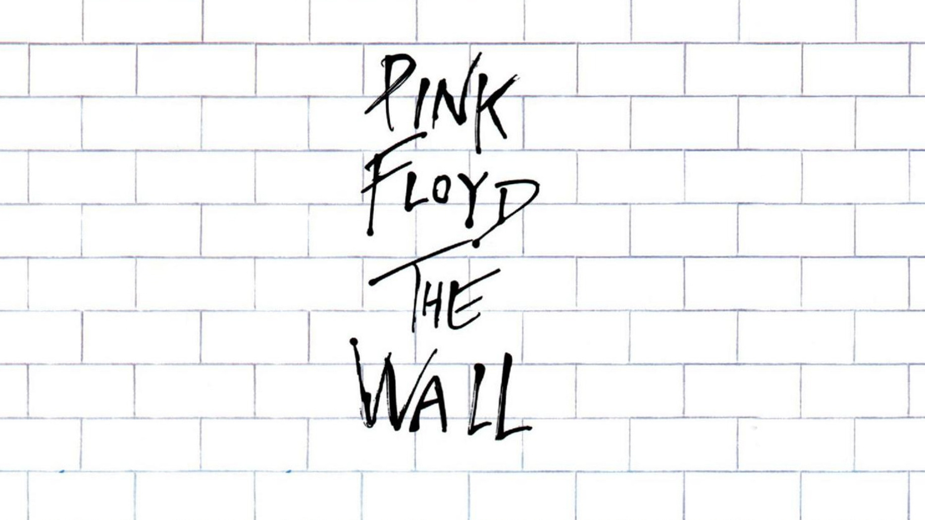
Creating the brick background was simple enough for an artist of Scarfe’s skill.
“The cover didn’t take long,” he laughs. “It’s just a grid, really. But we tried it in various different ways: there were dark black lines, there were soft grey line, big bricks, small bricks.
“The writing on the front was just written by me, very quickly,” he continues. “I think I would have done it with a little more panache these days. We were actually worried about blemishing the purity of the cover, and almost wanted not to have a logo on the front. But the commercial decision was that nobody would know what the album was, so the logo was put on a separate piece of cellophane inside the shrink-wrap. Pace you opened it, the logo fell off and you had a pure-white album.”
- 50 Years Of Pink Floyd: A Most Unlikely Reunion
- Classic Rock 214: 50 Years Of Pink Floyd
- The 10 heaviest Pink Floyd songs
- Waters: Why The Wall still matters

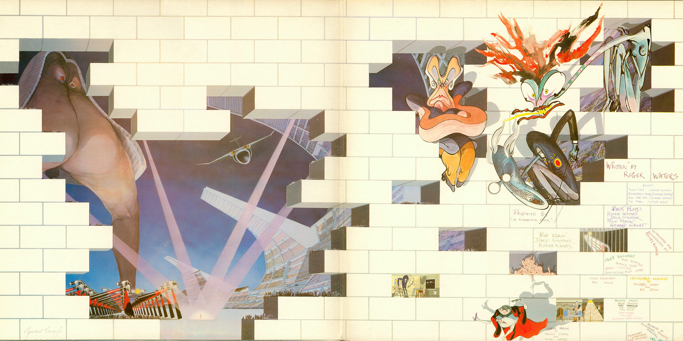
It’s hardly surprising that Scarfe felt the pressure most when attempting to create visual representations of the characters from the lyrics, as seen inside the gatefold sleeve.
“That was the most difficult part,” he admits. “They were all based on the characters in the music that Roger thad written –Pink’s mother, his teacher, his girlfriend. My job was to design them, and I had to finalise them early on in the production.”
Of course, The Wall album was just the start; Scarfe subsequently created animation shorts for Floyd live shows and for Alan Parker’s 1982 film The Wall.
“It was a very long project,” Scarfe recalls. “I mean, the actual sleeve was pretty quick, but the shows, and then the film… Over the three years it became pretty labour intensive. By comparison, the sleeve was a doddle.”
Prints of Gerald Scarfe’s work, including The Wall, are available from www.geraldscarfe.com.
