The old adage says that you should never judge a book by its cover – however, these 10 albums are just begging for you to do that. The vast majority of metal bands out there have at least one turkey in their back-catalogue but, in these instances, these artists were able to polish a turd, making something that sounds less than ideal truly look the part. From Metallica’s St Anger to Iron Maiden’s Virtual XI, below are 10 lacklustre metal releases that came packaged with some gorgeous artwork.

Metallica – St Anger (2003)

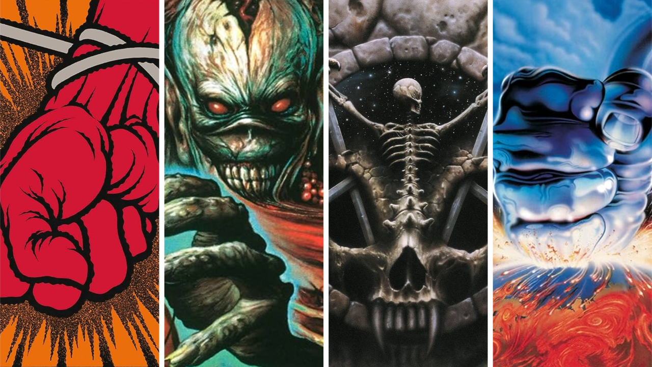
Everyone’s heard your St Anger takes a million times over, OK? Yes, we all know the drums sound like a back-alley fistfight between two trash cans, the songs go on too long and the lyrics suck. But here’s a different observation: that art’s alright, isn’t it? The vibrant oranges and reds stand out on heavy metal record shops shelves, not to mention against those sharp black cracks. Apparently Metallica planned to do some Warhol-esque pop art prints of this, but that got scrapped. Shame.
Iron Maiden – Virtual XI (1998)
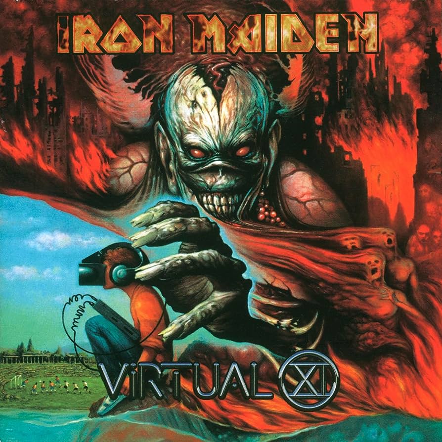
Much like St Anger, Virtual XI has become an easy target among Iron Maiden fans, many of whom punch down on Blaze Bayley and the flat production. Even the artwork, designed by Melvyn Grant, is apparently controversial, but we think that’s crossing the line when it comes to hating this album. The lion’s share of the cover is a Hieronymous Boschian hellscape complete with one of the scariest Eddies committed to canvas. Stare into those eyes and that Joker smile and try to not be disturbed.
Slayer – Divine Intervention (1994)
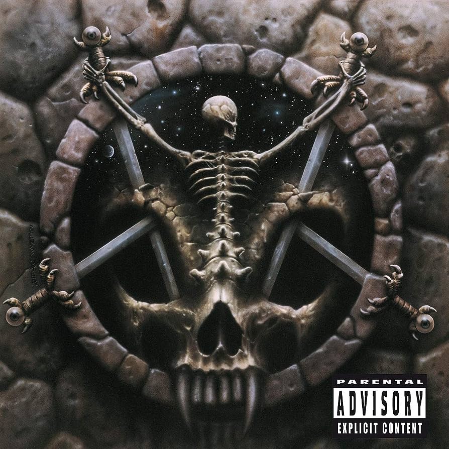
Off the back of Reign In Blood, South Of Heaven and Seasons In The Abyss, Slayer were thrash metal world-beaters. That gave them plenty of time and money to play with while making Divine Intervention – and, ultimately, that proved the album’s downfall. Slayer hopped between studios and producers to the point that it sounds disjointed. A massive upside, though, is Wes Benscoter’s artwork: it turns the classic Slayer logo into a D&D-like nightmare and might be the band’s best cover.
Judas Priest – Ram It Down (1988)
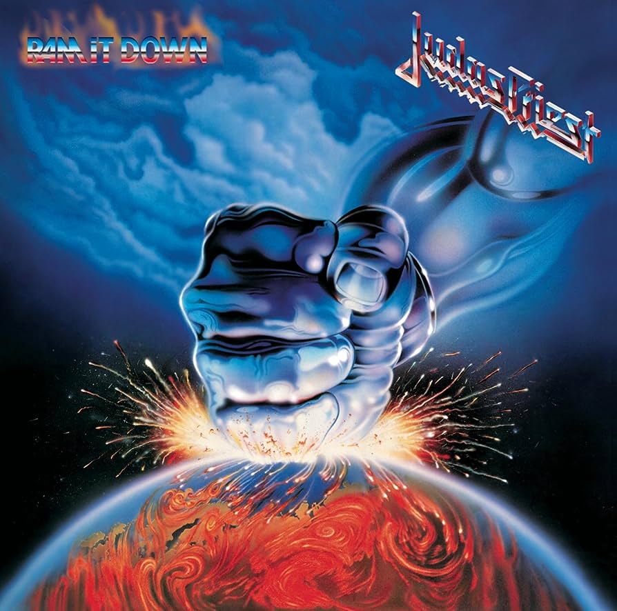
Initially, Ram It Down was meant to be released as a double album alongside its 1986 predecessor Turbo, with Turbo flaunting a flamboyant glam style while Ram… was a counterpoint of classic Judas Priest. Record label Columbia nixed the plan, though, and both albums were poorer for it. Ram It Down was received as a safe and uninspired record, despite the objective excellence of its cover. It’s God punching the Earth! You can’t get much more metal than that!
Trivium – Silence In The Snow (2015)
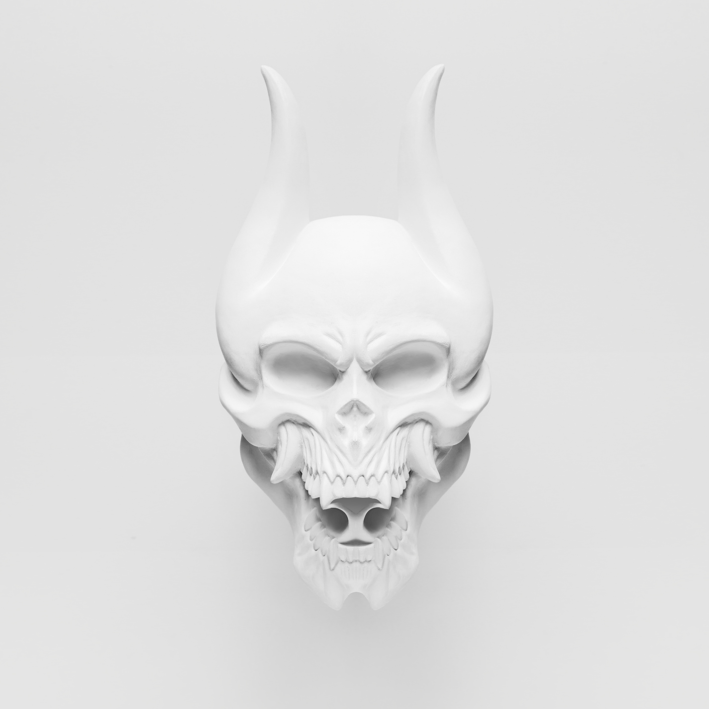
Silence In The Snow is far from the worst album, but the fact that Trivium have all but disowned it isn’t a great sign, is it? The Floridians’ foray into scream-free, vintage metal was necessitated by frontman Matt Heafy blowing his voice out and was met with both critical and fan disappointment – but at least that white oni on a white background looks badass. In fact, it’s so cool that it’s still Trivium’s mascot, despite the band returning to their more savage ways in 2017.
In Flames – Battles (2016)

By 2016, In Flames had long-since ditched the melodeath that made them famous and were eyeing arena-metal renown. Even compared to lacklustre predecessors Sounds Of A Playground Fading and Siren Charms, though, Battles was shit, deficient in both imagination and vigour. All it had going for it were the songs The End and Wallflower, and that cover art. It’s a unique fusion of a psychedelic colour scheme with morbid metal imagery and we can’t stop staring at it.
Testament – Demonic (1997)
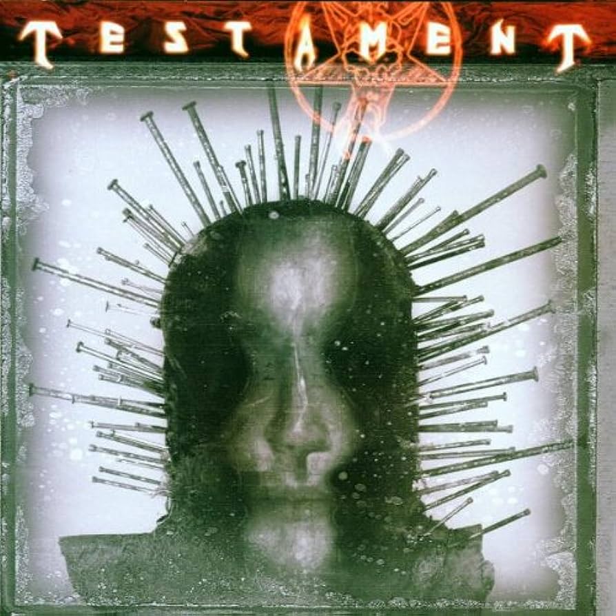
Fair play to Testament: during the mid-to-late-’90s, countless thrash bands softened or slowed down to fit into a post-grunge world. These Bay Area originals, though, charged in the opposite direction, went all-out death metal and gave Demonic some haunting artwork to go with it. The spiky figure on the front was Craig Jones before Craig Jones was Craig Jones. If only the album’s music hit as hard, since its ostensibly heavy grooves actually feel awkward and clunky.
Iced Earth – The Glorious Burden (2004)

In 2004, The Glorious Burden expressed Iced Earth’s US nationalism as subtly as a star-spangled brick through your window. The album jerked America off so hard that Yellowstone almost erupted in orgasm, featuring stupidly long “epics” about Gettysburg alongside a ballad that vowed revenge for 9/11 and has since aged atrociously. The cover looks so majestic that we’re stunned it’s not a hundred-plus-year-old painting, but that’s the only nice thing we can say about this.
Diamond Head – Borrowed Time (1982)
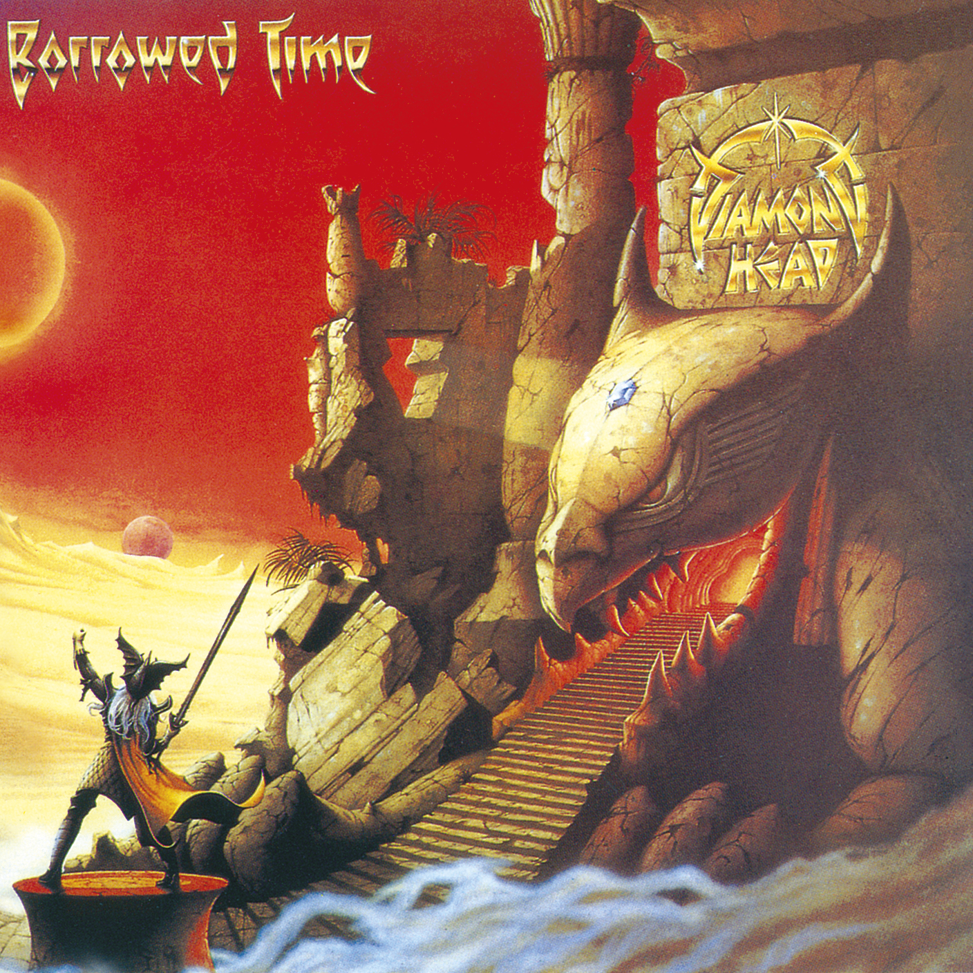
Borrowed Time is baffling. Despite Diamond Head being just two years removed from releasing the lauded Lightning To The Nations, their signing to major label MCA made them retroactively demote their own masterpiece to “demo” status and half-fill this album with tracks everyone had already heard. Meanwhile, the new stuff was softer and more prog than before, so disappointment all round! That cover was the most expensive MCA had ever commissioned at the time, however, and it was money well spent.
Fleshgod Apocalypse – King (2016)
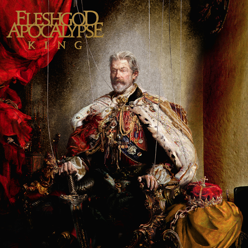
King somehow takes the orchestral death metal batshittery of Fleshgod Apocalypse and makes it boring. Slow-burners like Cold As Perfection saw the band try to grow up when what everyone fell in love with was how overblown they were, especially on the machine-gun-rapid and symphonic The Violation. At least the band tapped painter extraordinaire Eliran Kantor for a lavish yet biting piece, which shows a king in all his grandeur subtly being controlled by puppet strings. That’s genuinely great satire there.
