I make album covers. Part of the way I judge the quality of an album cover is, of course, its visual appeal. Sometimes this relies more on an illustrative, narrative element rather than pure impact. Sometimes it’s based on a clear design that relays a very clear message or simply pushes my expectations.
In the best case scenarios, it’s a very simple image that stays with you forever. Some of the obvious examples include, but are not limited to, Dark Side Of The Moon. If you think Pink Floyd, it’s literally the first image that comes to your head. It’s the power of album artwork to take the listener to a specific album visually, it’s kind of a unique thing and not something a lot of people give a whole lot of though to, but it’s something we immediately imagine. It is how we remember. My brain doesn’t think of songs first, it thinks of the album cover.
When I was younger – and realised there was music outside of pop and the music that my parents were listening to wasn’t the only thing out there, and there was a different more obtuse, angry, angular, more interesting provocative style out there – one of the first album artists I came across was Pushead. At that time when I was a teenager, every metalhead that I knew was wearing Metallica t-shirts with Pushead designs on them. So as I became interested in punk rock and started collecting records, my interest in the Pushead records began. He was an artist at the same time as an illustrator at the same time as a designer. For example take this record…
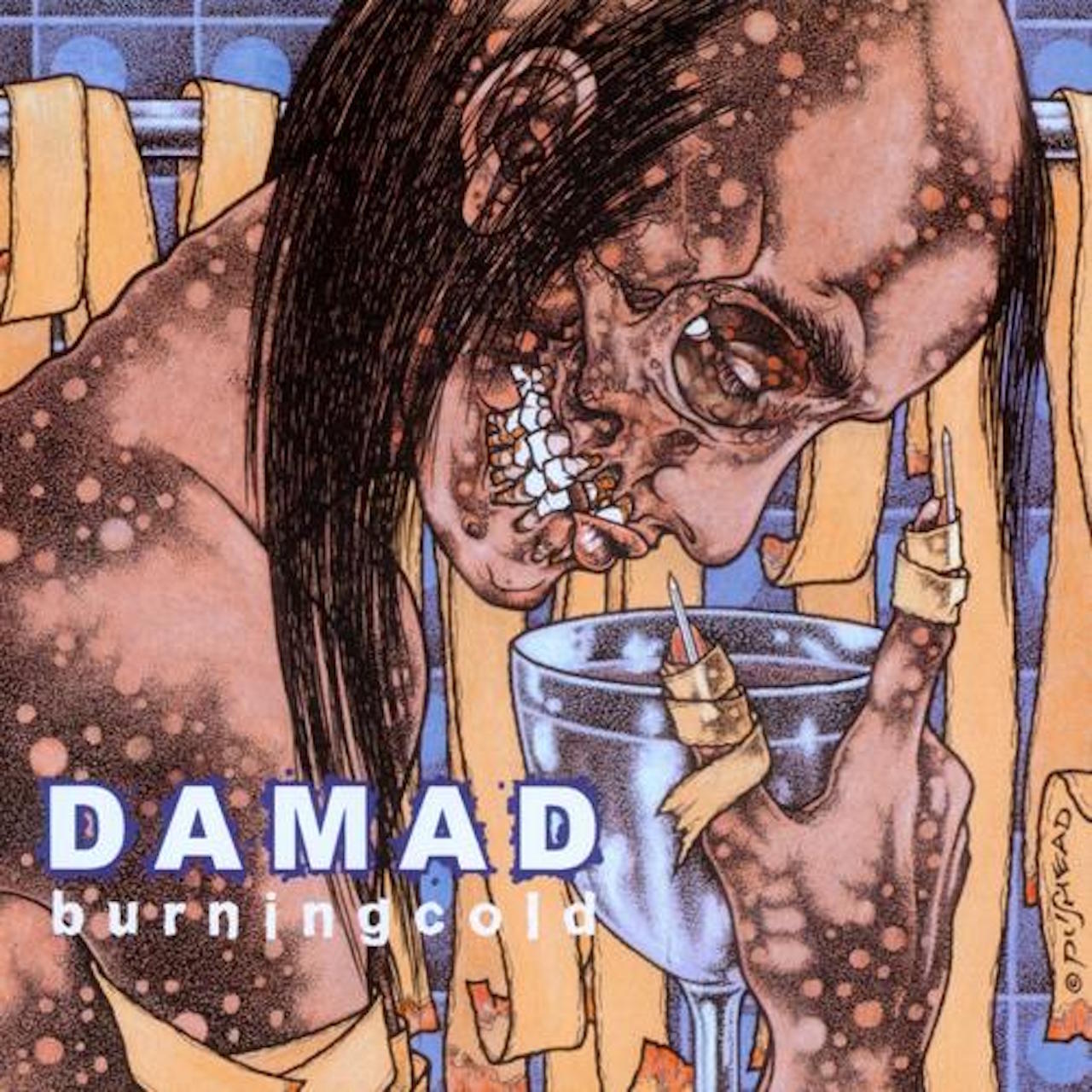
DAMAD – Burning Cold
This is actually one of my favourite Pushead illustrations of all time. It’s truly bizarre, as a lot of his illustrations are. What I find is that even in contrast to most of his other illustrations, this one is discomforting. I’ve never been able to figure out what’s going on, except that it’s a character in what looks like a bathroom, a chalice and nails on fingers… immediately there’s a visual chaos happening with these dots and rags and things in the state of decay. There’s a lot of interesting graphic elements but it’s discomforting. The first time I saw it I felt uncomfortable and when I listened to the record I felt the synchronicity between the discomfort and chaos and at times directness of the album cover that was mirrored in the music. For me, as a young artist, I realised the synchronicity bolstered the record and made it more of an experience to me and that through the visual side of album art you can push people into the record, and you can expand on the record through the artwork.
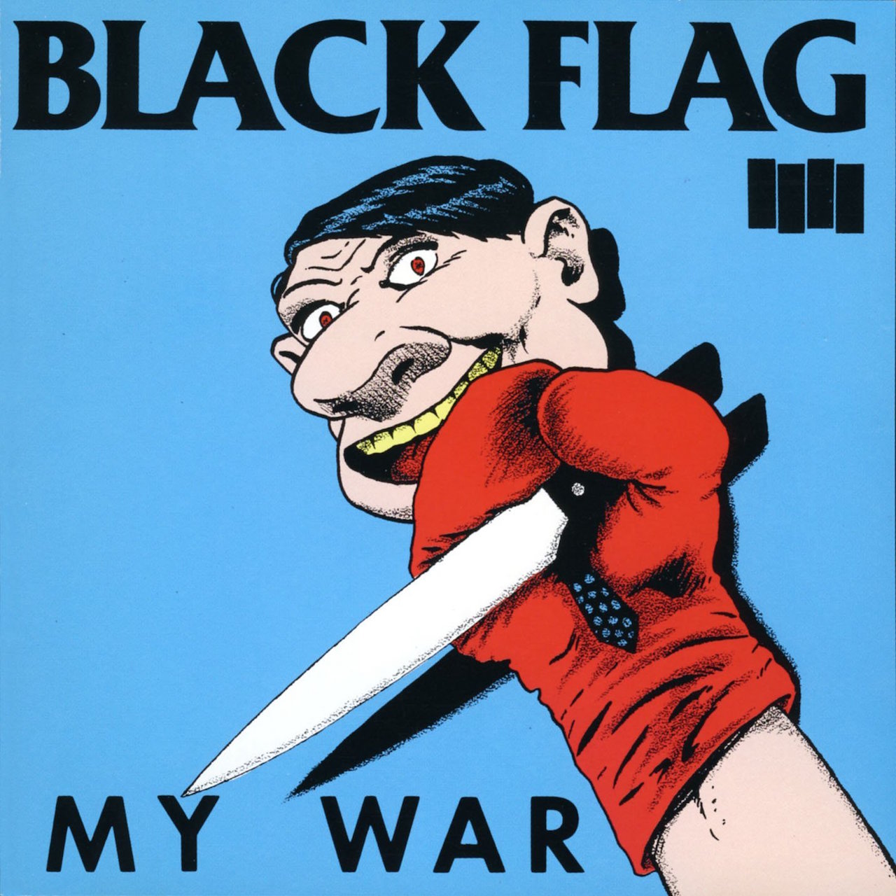
**BLACK FLAG – My War
**This may be my favourite album cover. It’s a top five, definitely. There’s a simplicity in design that makes an impact. There’s a directness in the imagery and design for a similar impact. Then there’s the odd factor, and it’s that oddness – and this goes for all the Black Flag covers, and all of Ray Pettibon’s artwork. You’re familiar with what you’re looking at, it’s figurative. I recognise the boxing glove, I recognise the knife, I recognise the face, and though I’ve been looking at it for years I’ve never quite strung together what the images mean. It’s almost as if he’s wilfully ignoring something about the record in order to make the record something more mysterious, and it’s that kind of aesthetic that will keep you interested and keep you involved. And from a pure design standpoint, this has ‘80s written all over it from the font to the garish colours. The blue is the same blue they used on skate decks and t-shirts and everything in that era, and it’s been seen a thousand times. And when you get inside the record it’s a masterpiece of dissonance, aggression and intellect and that’s what we’re looking at a picture of.
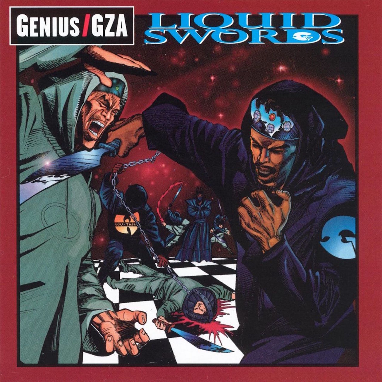
GZA – Liquid Swords
This is one of my top five records that’s ever been recorded and maybe the only example I can think of of a comic book artist successfully executing an album cover. Again, it’s simple and cartoonish to the point of almost being comical, but the record itself is incredibly dark. The story is brutal and complicated and very artistic. This is the first time I heard a hip-hop record that had that kind of headiness to it, and darkness to it, and anger, and narrative that I liked about punk rock. So that there’s this extremely violent album cover which I guess is GZA being a ninja and killing somebody – but it doesn’t matter ’cause it’s such an iconic record for me. It’s so different to other records from that era. It doesn’t have any weird self-glorification thing on it, yeah maybe it’s him with the Wu-Tang thing, but I don’t know what the scene is and I don’t know what it’s supposed to be. I don’t want anyone to explain it to me because that’s a snapshot of a little universe and I love it.
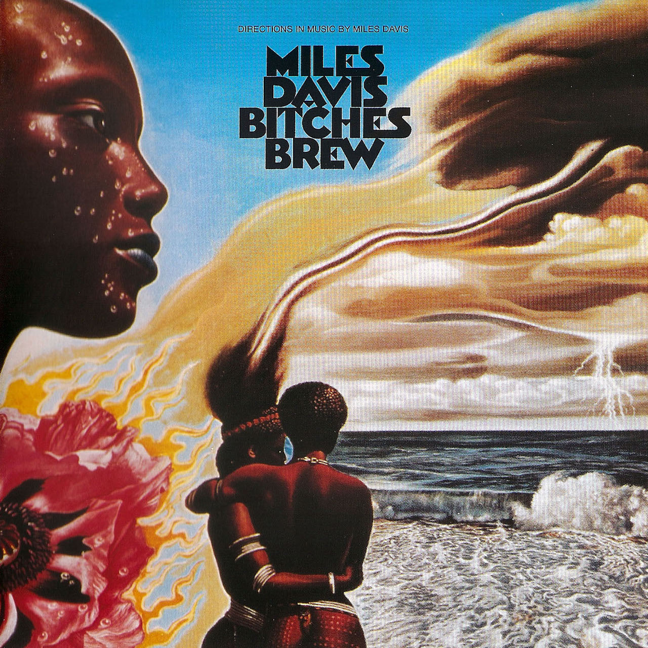
**MILES DAVIS – Bitches Brew
**This is undeniably the definitive experimental jazz record that guys who listen to rock like. There’s no one record that is as adored by the rock community than this. The album artist is this guy Mati Klarwein who is a very weird, surrealist painter from the ‘60s and his catalogue of paintings is mind-bending. Technique in painting is artifice as far as I’m concerned, it’s like fancy guitar players who can’t write a song. This guy’s got insane technique, but not all his pictures are hits. This one is slightly obvious because it’s got the poppy flower, which is one my go-to symbols for Baroness records, and if you open the gatefold there’s a very strong racial component and the heroin reference, and the unity thing happening – all of which is relevant to the record and the time period when it was created. But there’s this strange factor to it. All the images are blunt and obvious but the total scene if I were to describe it would not make a whole lot of sense. As musicians we don’t want to pull back the curtain and reveal the wizard, it’s not important. What’s important about art is the presentation and the immediacy factor should be there. But as listeners we want to peel back, and we want to continue to listen and continue to look, so the more layers the cover artists can create the more I as a fan of music will return and investigate. I want to know why the scene’s happening. It almost doesn’t matter if there’s a reason for the water and the fingers interweaving, the albino versus the dark skin and the sweat… I get it as a whole, but I don’t understand it in pieces and that’s the same way I feel about Bitches Brew. It bends my mind to think about what he did to create that album. I’ve probably listened to that record and hundred times and I’ll definitely listen to it a hundred more times before I stop listening.
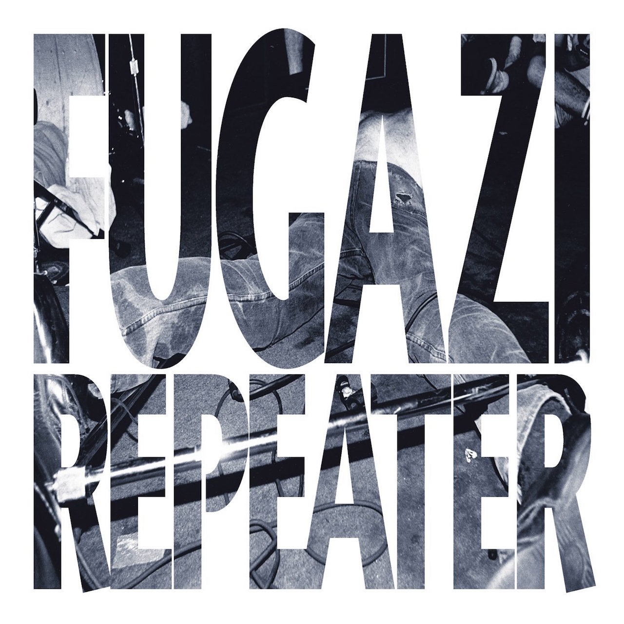
**FUGAZI – Repeater
**This was my introduction to smart punk rock and my introduction to an album that had a very strong, immediate sense of design. Obviously, there’s a live photo of a guy being punk on stage and there we have the energy. We have a snapshot of that time period for this band who were not just influential on punk musicians but music in general because Fugazi at the time were the number one selling independent band on the planet. This is without merchandise, this is without advertising, this is with $7-8 records. This is unbelievable. To bolster the ethos of the band we’ve got something very simple that has impact but an innate, raw beauty to it. To me, if you see this image, you know the time period. I grew up on the East Coast at the tail-end of Fugazi, but the DC scene was so influential to me. It’s just their name, the name of an album, and a picture that you can barely see. They’re not sensationalising who they are, they’re not trying to make anything look pretty, they’re just trying to be as simple as possible. As the artists that they were, this fits their aesthetic perfectly. Anybody could have done it – take any photo, put a font on it, obscure the guys in the band and that’s that. That’s what Fugazi was, the point of Fugazi was that we shouldn’t canonise the musicians. We should be simple, be blunt, be effective, but speak with a unique voice. If you see a glimmer of this cover from across the room you instantly know what it is and the whole album unfolds in your head, and as a designer, that’s what you’re looking for.
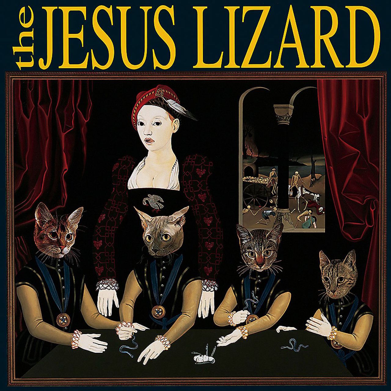
THE JESUS LIZARD – Liar
This is one of my all-time favourite records. It’s a record you could not replicate if you tried, there has been no band that sounds even remotely like The Jesus Lizard. They’re the only band that can pull of that sound. They’re a band that’ve essentially come from this raw punk place, but in spite of that the musicianship is top notch. I don’t know any drummers form our scene who don’t worship his drumming, or guitarists who don’t think Duane Denison is one of the best guitar players. There’s a simplicity that belies an incredible amount of talent from the rhythm section and there’s a baroqueness – it’s like [The Police guitarist] Andy Summers playing for a noise rock band. There’s a painting and what the fuck is it? It’s cats hanging out at a table, dressed in some period-specific outfits, a Hieronymus Bosch painting in the background with a classical look to it. It’s just bizarre. I love the painting and it’s a pleasure for me to look at. It’s like a comic but not in the way that I want to laugh at. It’s a dark, strange comedy that could potentially change into perversion at any minute – and that’s The Jesus Lizard.
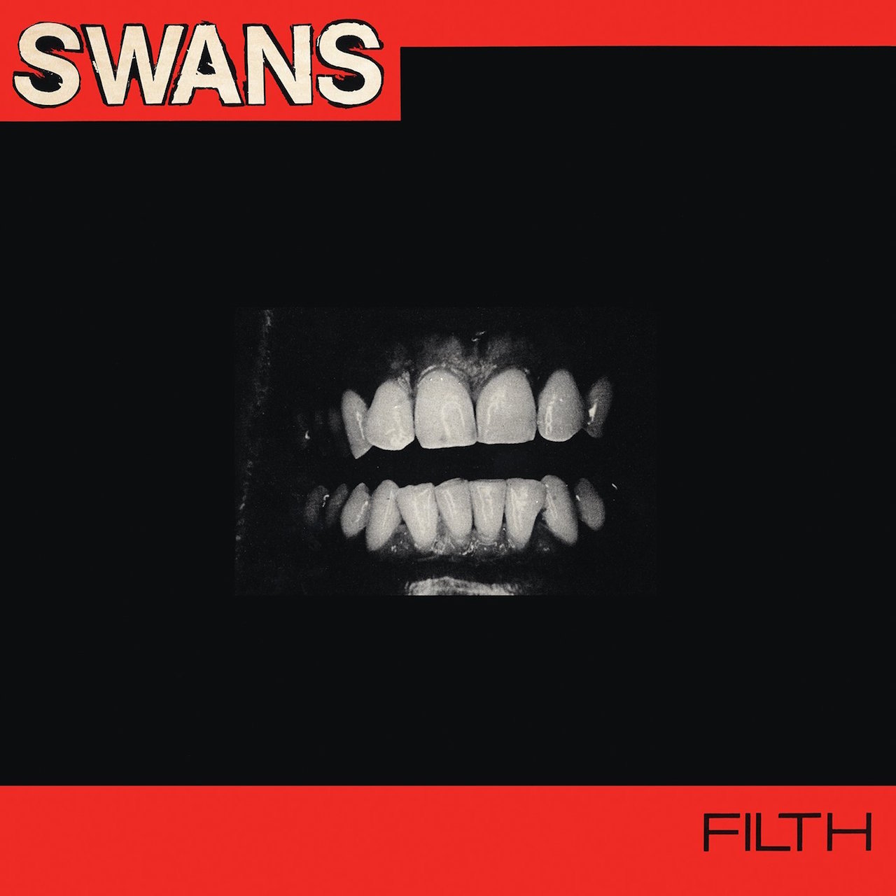
**SWANS – Filth
**If you play heavy, angular music and you haven’t heard Swans, you should and this is where you need to start because this is where they started. There are very few records that upset me in this way and it’s because of the Swans font, the obscure picture of teeth and the record’s called Filth. When we see a mouth and the word ‘filth’ there’s nothing pleasant that comes to mind and when you play this record, nothing pleasant comes to mind. It is unpleasant by choice, it is unpleasant by nature. For me this is Converge’s Jane Doe, Mistfits’ Crimson Ghost, Iron Maiden’s Eddie – this is their simple image. It’s disturbing and I like that. I like to be pushed to be upset and when a band figures out a way to do that sonically and put it into a vision I applaud that. It’s very difficult to upset people. This isn’t something you could wear to school, your teacher couldn’t tell you why you shouldn’t wear that shirt but they wouldn’t let you wear it to school again.
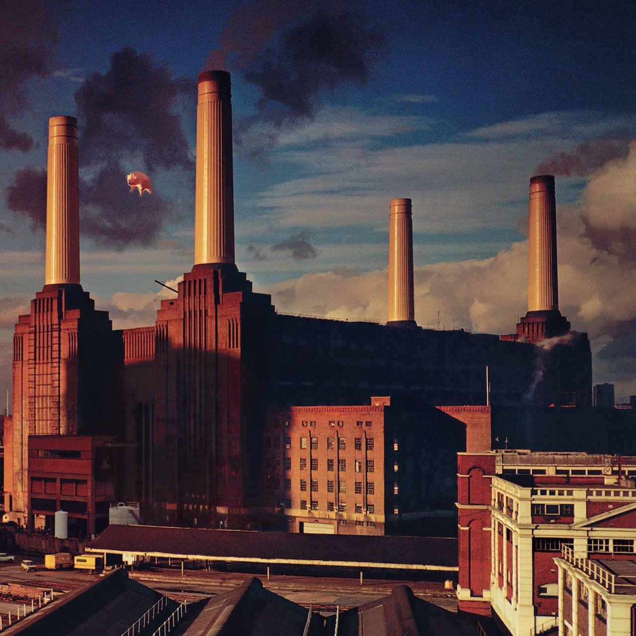
PINK FLOYD – Animals
Pink Floyd are the pinnacle of a band with a clear sense of their own aesthetic and a very focussed, consistent vision. I could talk about any of their albums, I’m just talking about Animals because I like it today and I was listening to it last week. One thing I’ve always aspired to through Baroness is to have this level of consistency in vision and this level of progression in terms of music. They worked with Storm Thorgerson on every project but he wasn’t an internal member, so he gets to take the record through his filter and come up with an image. It’s a very regional image that fits for the bill for Pink Floyd and it’s definitely one of their angrier or more antagonistic records, it’s a button pusher of an album. They’re capable of writing these timeless pop classics but the whole point was that they were dissatisfied with English culture and the society they found themselves in. In some highly intellectual way, this is a beautiful representation of that. There’s nothing obvious, it’s completely unexpected, yet if you line all there albums up there’s so much consistency and diversity in the art that Storm made for them. From Dark Side which is simple and effective, to Animals which I know is a photo but you’ve got to zoom in to see the real point which is the pig. Anyone who lives in London is familiar with this view and at this point in time, the cover is as famous as the factory itself. It’s a good example of how powerful an album image can be.
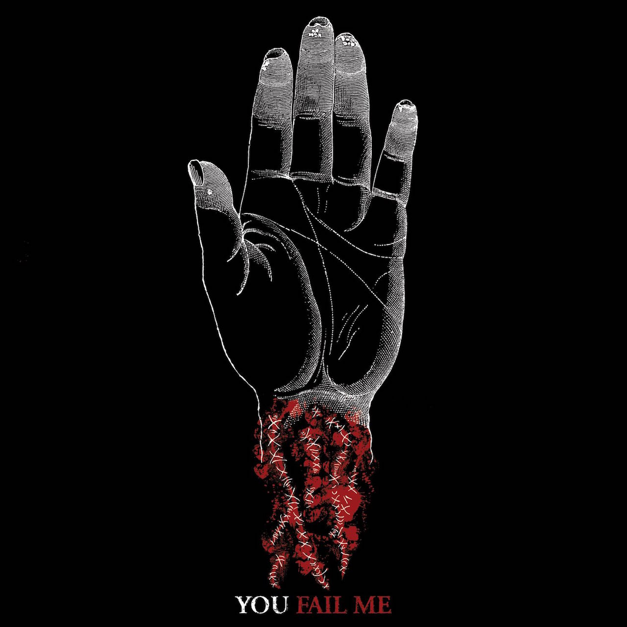
CONVERGE – You Fail Me
This is so much different to Jake’s [Bannon, vocalist and artist] other album covers but it’s such an effective and memorable image. All the elements of this match their aesthetic. The title and the image work in this bizarre way. It’s not the obvious image for the title but it’s probably the best image they could have used for that particular title. I think it’s a total play on the punk rock thing which is typically black, white and red – those are the T-shirt colours you’ve seen at punk rock shows since the ‘70s. When you look at the details, and when you reverse the cover to see the image it originally was, you can tell it’s a picture with some sort of disease – so there’s this element of decay. And if you look closely at the things in the blood, they’re all little hearts. So there’s the poetry Jake has in his lyrics, but the chaos and decay that’s a signature part of their sound. It’s intense.
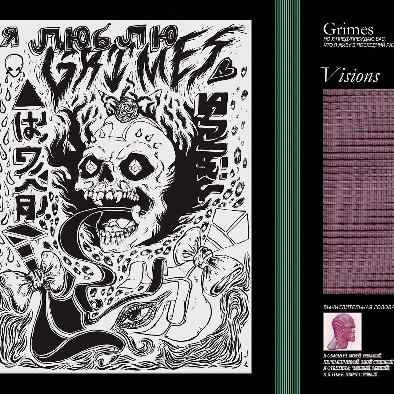
GRIMES – Visions
I’m a fan of this record and I’m not a 13 year old girl. I love this cover. It’s got this skate, thrash quality to it. It’s definitely bizarre. There’s some really nice, incongruous graphic elements to it and all this strangeness. I don’t think that a person who’s a flexible illustrator can do this, you have to be kind of tweaked to do this, and I appreciate that. I appreciate the unhinged record covers that just push me. It’s a fantastic album cover and a very good use of this bold, black and white style that every skate or thrash compilation that came out in the ‘80s. It looks like Suicidal Tendencies merch.
John Baizley was speaking to Luke Morton. Baroness’ new album Purple will be released on December 18 via Abraxan Hymns.
John’s art blog can be viewed here.
