When the Hipgnosis design studio dissolved in 1983, having created the defining album sleeves of the 70s, lynchpin Storm Thorgerson dabbled in everything from music videos (“the anus of the business”) to commercials (“emotionally and intellectually bankrupt”) before returning to the medium that made his name. A wise move. Even after his death in 2013, he remains the most respected cover artist of them all, equally noted for his daring and inventive work with modern bands as for his classic Pink Floyd and Led Zeppelin sleeves.
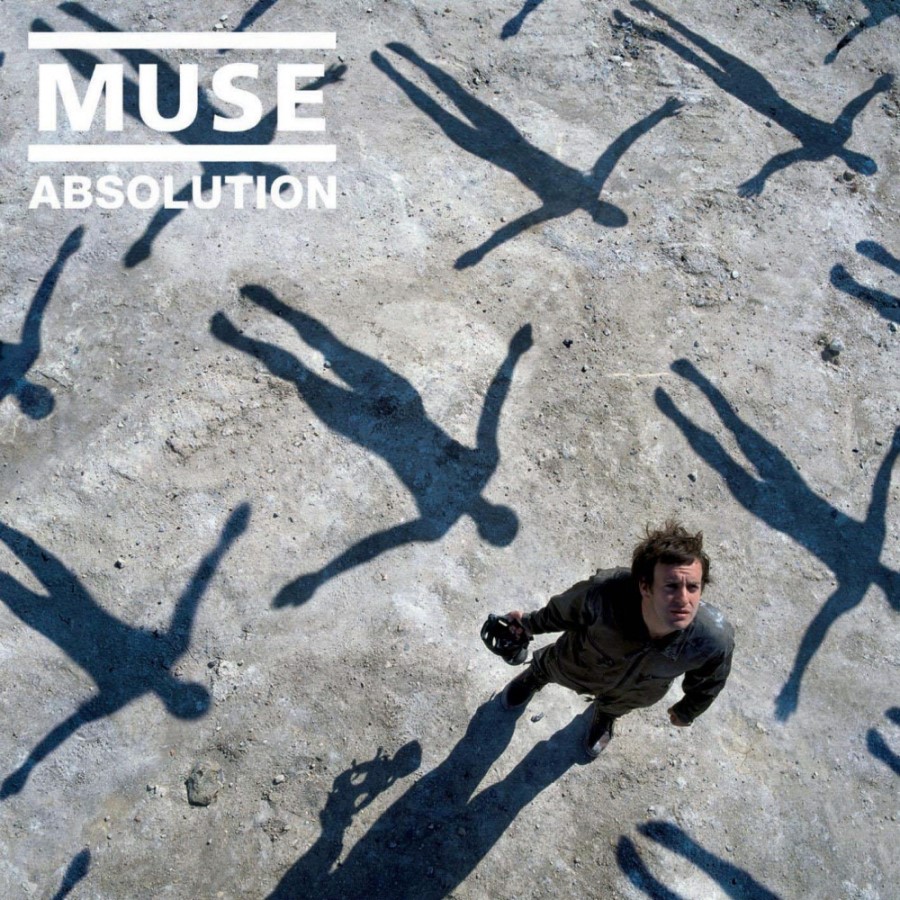
Conceptual, grandiose and touched by the hand of prog, Muse always seemed like a band Thorgeson should be set loose on, and he got his commission as they scouted for ideas for 2003’s Absolution. “Muse saw the basic design on our website and asked if we could do it properly,” Thorgerson wrote in his blog.
- Storm Thorgerson: Sheer Art Attack
- 18 Memorable Matt Bellamy Quotes
- Muse: Your track-by-track guide to 'Drones'
- Muse's Matt Bellamy on riffs, revolution and bad behaviour
After discussion, the location agreed on was a gravel pit in Essex and the photographer was Rupert Truman.
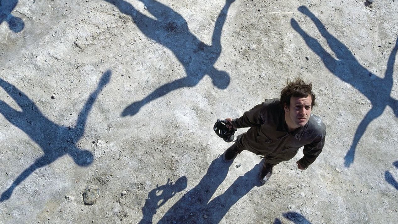
The theme put forward by the artist was “a character looking up to the sky to witness a squadron of giant flying people passing overhead – silent, mysterious figures who we can see only by their shadows… perhaps on their way to absolution.” Also important was a sense of mystery. “We’re left to view them through his eyes,” the artist noted, “not sure who and what they are, nor their effect on him. What are the flying giant people? What are they doing? These questions are left open, because all the viewer knows is the shadows, not the thing itself.
“We were unsure of the character of the person looking up,” he added, “ so we took several variations and used them all, for vinyl, DVD, posters and adverts.”

The visual effect was a perfect complement to the apocalyptic theme that runs through the music, and Thorgerson was justifiably pleased with the result.
“[It was] intense, heady stuff and a pleasure to work on,” he said. “The sleeve reminded me of a children’s illustration by Maurice Sendak: full of magic, like a fairy tale. I felt it had a strong graphic element as much as a narrative element, and the two together are what makes the image work.
“I hasten to add that the shadows are real and awkward to arrange, especially given the poor English weather. A strong midday sun was essential – we should have gone to Spain.”
