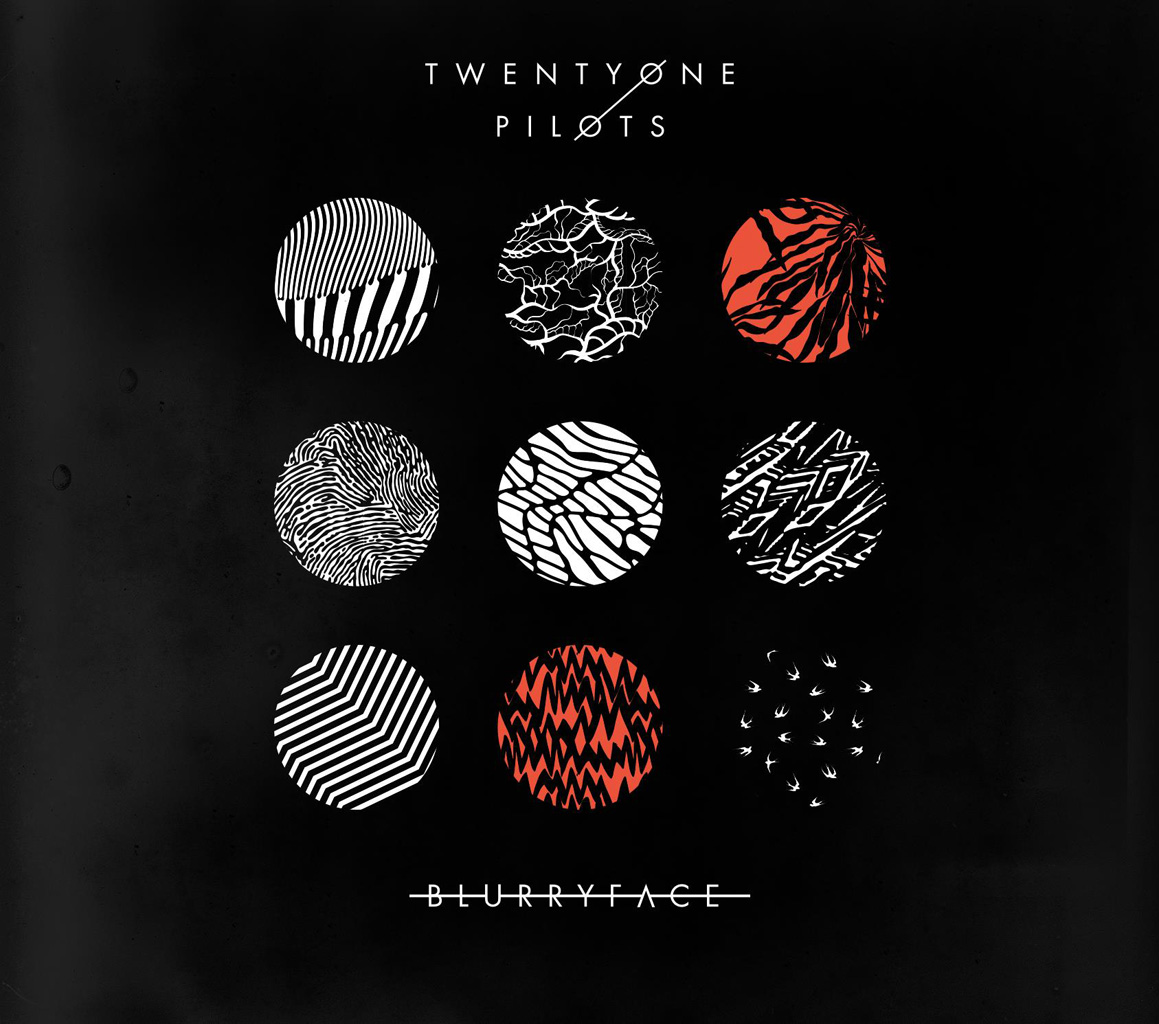
Brandon Rike, the graphic artist who designed the packaging for Twenty One Pilots’ latest album Blurryface, has revealed the concept behind his work.
A conversation with the band’s Tyler Joseph inspired him with three key elements that moulded the final design.
Rike says in a blog entry: “Tyler explained the elements of ourselves that we hate, and the constant battle against these traits. In order to add clarity to this internal struggle, he gave a name to these negative attributes: Blurryface.”
He then defined the most important things he had to achieved: “First, find a way to represent Blurryface in a obscure but potent manner. Second, create visuals that resemble the songs, as well as the mishmash of the collection as a whole.
“And finally, reward the fans for their support of the band, and give them new journeys of discovery as they dig deep into all of the elements of the album.”
Rike calls the result a “tapestry” and adds: “In addition to representing the feeling of each song, the collection of all 14 patterns would visually represent the diversity of the album as a whole.”
Burryface, Twenty One Pilots’ fourth album, topped the Billboard 200 chart this week. They return to the UK in November:
Nov 04: Glasgow O2 ABC
Nov 05: Manchester Ritz
Nov 06: London Shepherd’s Bush Empire
Nov 07: Oxford Academy
Nov 09: Birmingham Institute


