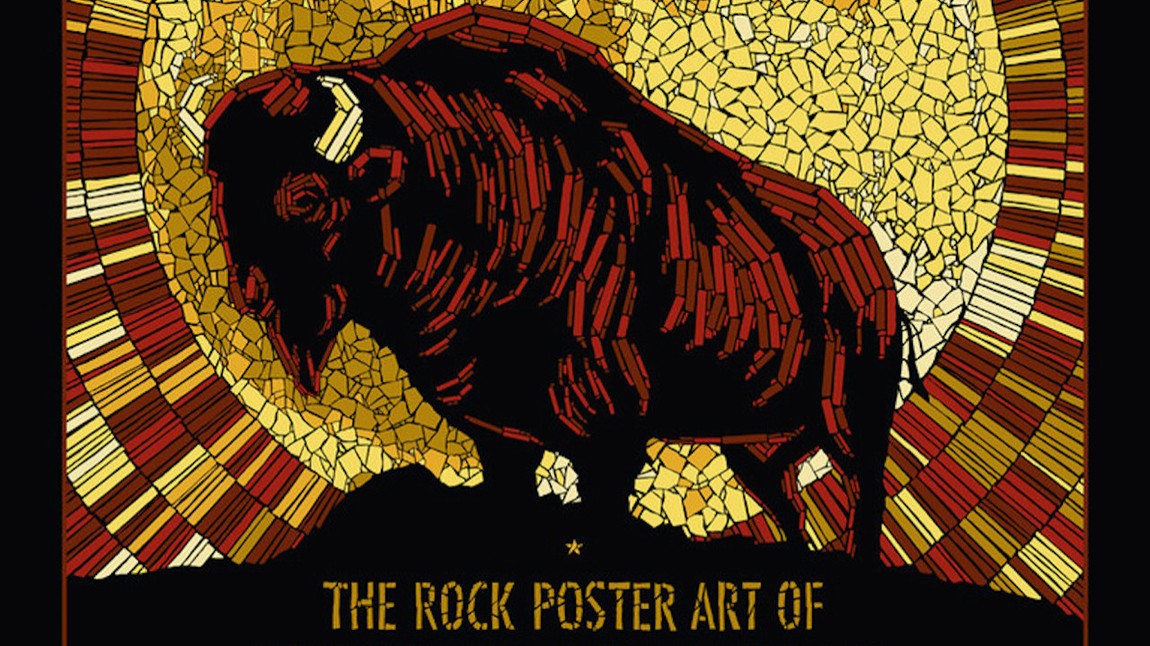
Parts Pointillism, parts Impressionism, Todd Slater’s unique take on the humble gig poster will make your jaw go slack, your head spin and have you emitting a strange awed sound from somewhere in the back of your throat.
Slater works out of a converted garage on the fringes of Austin, Texas, and his artworks set a spark in the mind and have you fumbling for superlatives for them, which no doubt supersede, or at least rival, those for the gig you’re about to experience.
It would be easy to list favourites, and there are many; a Jane’s Addiction/NIN double-header is a clever nod to crime noir (think Sin City on a budget), and is both mischievous and startling. As too are the densely coloured screens for Patti Smith, Primus or Ween, although for a dozen different reasons.
As fellow poster designer Rob Jones observes in the book: “There is a lot going on through his artwork but nothing goes to waste. His artwork is intricate but also very bold. No stroke is wasted in pushing his narrative forward.” Too true, his florid colours have a surprising lightness of touch, and each piece echoes with the same sentiment: come on in. And you will.

